Part A of Assignment 1 for the Contemporary Arts section is to reflect on the question ‘what is art’. I then had to reflect on what I’ve learnt, what I’d like to develop and how I think my learning log is progressing and can be improved. Below are my written notes that I used to help gather my thoughts and type up my response to the assignment.
For part B, I had to research ‘The Battle of Orgreave’ by Jeremy Deller and then write a 1000 word response. This should give my interpretation on the piece and reflect on the importance of time and place. Again, below are my research and essay planning notes.
Reflection in regards to assessment criteria:
Demonstration of subject-based knowledge and understanding – In my assignments I think I show a strong level of understanding and that I’ve clearly researched the subject. For instance, I didn’t know much about The Battle of Orgreave but have included various contextual information such as dates and facts to back up my response. Furthermore, I tried to convey my own opinions in order to show my understanding of the piece.
Demonstration of research skills – I believe I have displayed my research skills well as I have utilised various sources such as the internet (including articles, reviews, videos and images) and books to gather information about the subject. Additionally, I believe that the images above show that I can clearly plan and carry out a research project with the aim to write an essay.
Demonstration of critical and evaluation skills – Within my assignment, I have displayed evidence of these skills through the discussion of Deller’s piece. For instance, I evaluated the piece and questioned the concept of contemporary art and whether it can be classified as such. I also analysed the piece itself and backed up my thoughts with reviews from critics in order to synthesise contextual information and my own interpretation. In regards to the subject of time and place, I tried to show that I can engage and debate the importance of these themes within a piece of art.
Communication – I am confident in my ability to communicate my ideas in an engaging way, in order to best show the knowledge I have gained and how my thoughts develop. I like to present my response in clear paragraphs so that a clear beginning, middle and end can be identified, but also so I am able to communicate the points I want to make. Furthermore, I understand that images are not always necessary and should only be used if relevant, as I am a visual learner I believe the use of some images can help the reader to picture the subject whilst reading my interpretation. Therefore I included two images in my essay but think this is well balanced in the overall presentation.
Looking back at the various artwork I’ve encountered in this section, here are some final questions I was prompted to think about:
Have you been surprised by your responses to any of the works in Part One? Have you felt inspired by any of the works you’ve looked at?
The Physical Impossibility of Death in the Mind of Someone Living, Damien Hirst–
I was surprised by the depth of contemplation this piece allowed, I knew it linked to the theme of death but I was able to look at it from new perspectives. For instance, the idea of mortality and trying to stop or control time is something I find interesting and without this piece, it might not have been something I’d have considered properly.
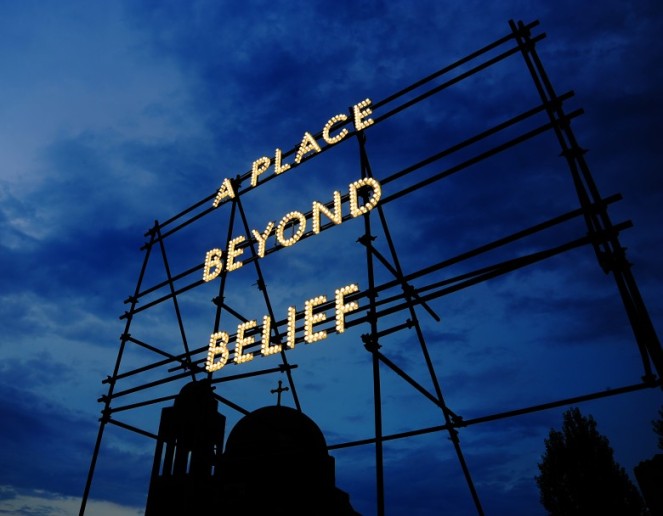
A Place Beyond Belief, Nathan Coley –
At first glance, this piece seemed quite simple, yet I was surprised by the importance the message actually holds. Looking further into the context and specifically the origin story I realise that Coley designs his site-specific work for those who need it most. I’m really interested in the power that a phrase can have on a population that may have given up hope and therefore was also inspired by this piece. I think he should be commended for his methods in pushing boundaries and commenting on controversial topics as it promotes others to contemplate them more.
Longplayer, Jem Finer –
This piece can certainly be described as being ambitious, I hadn’t even fathomed the idea of a piece of music being played continuously for a year, let alone 1000 years before coming across Longplayer. It’s such an unusual representation of time but holds great significance in relation to how things change as time passes. What’s even more interesting and surprising is the fact that we’ll never know if Finer’s experiment is a success, but regardless of that, the attempt is definitely inspiring.
Vatnajokull, Katie Paterson –
Like Longplayer, this piece is an experience and was really intrigued by Paterson’s exploration into essentially making it interactive. Setting up a phone number to bring a sense of place to people across the world is a very clever idea and something I find inspiring. Furthermore, it demonstrates the severity of global warming which is something I deem very important.
When first looking at Nathan Coley’s A Place Beyond Belief, I’d say it’s quite mysterious due to how simple it is. However, I also think the text is quite thought-provoking and poetic, almost with an otherworldly sense. I’m definitely intrigued about where it is and why it was installed there. I’m guessing due to the large size and the fact that the illuminated text somewhat resembles a fairground attraction that it’s something Coley wanted to be very visible and seen by people.
Before looking into the piece further, I did have some initial questions –
Where is it? It is the location important? Is it temporary? Is it a one-off? What is the meaning of the text?
In terms of what type of work it is, I’d say it’s a combination of things. Firstly, due to the scaffolding, it is an installation and probably partially site-specific. The location and light up aspect also lend itself well to photography and since it is in a certain location, photographs would certainly allow it to be more accessible on a more global scale. Since I’ve already looked at Coley’s work within the earlier stage of this course I know that his use of text is often used to criticise society and therefore this piece could potentially be regarded as one of political commentary and visual communication.
So, what do I think it’s about?
Personally, I think it’s reflecting on the world and society, perhaps in relation to the many negative issues and how better times seem unbelievable. I do also think it offers a sense of escapism and potentially hope for a brighter future. In fact, if you look at the keywords ‘beyond belief’, they’re often used to emphasise how bad something is or when something is extremely surprising or unbelievable.
In order to find out more, I listened to a short monologue of Coley talking about the story that prompted him to create the piece.
He had heard a radio broadcast a week after the 9/11 terror attacks in which a woman tells a story that occurred on a subway which highlights the confusion, apprehension but more significantly, the divide that the events created. Riding on the subway was a Sikh man who faced racial prejudice and hatred (he tries to avert the glares of other passengers while sobbing, face down). Before getting off, the man gives his money to a black woman and her new-born baby which results in the rest of the passengers being reduced to tears. It is at this point that the woman realises that to move on and slowly move forward, they must find a place beyond belief – one that puts the hatred, prejudice and divide behind them in order to create a more united society.
I thought the monologue and story were very emotive as it conveys the aftermath of the terror attacks and the sheer impact it had on everyone, including the issues such as racial divide, that arose. There is still an element of hope in terms of bringing people together and putting differences behind them in order to offer a sense of relief and a better future.
After listening to the monologue, I do think the additional context allowed me to have a better understanding of the piece and to appreciate the importance of the message. The fact that is is so simple means you can contemplate it more and thus, it becomes more effective.
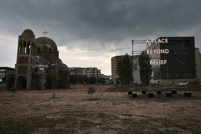
Looking at Coley’s website, I found that this installation is 6m x 7m x 3m in size and was on display in Pristina the capital of Kosovo, next to a library and a half-built/half-ruined Orthodox Church.
A Place Beyond Belief, Nathan Coley, 2012 – The Guardian
I don’t know much about Kosovo and why Coley chose this location for the piece however after reading an article by The Guardian’s art critic, Charlotte Higgins I have a better understanding of Kosovo’s history. There are various political issues of corruption and a fragile relationship with Serbia. The divide between Albania and Serbia is also prominent so Coley’s text is something that promotes a better future and offers hope to unite the populations.
Overall I think that Nathan Coley’s A Place Beyond Belief is a successful piece. At first, it seems simple but with contemplation, you realise the impact it can have. It helps to reduce division and provide hope for a more united front to places that need to move forward.
Here are some of his other work that conveys similar themes and messages:
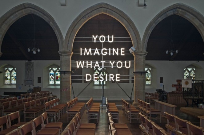
This piece was also installed in a church and possibly shows Coley’s disdain towards religion. It was clearly placed in a church to convey a certain message and perhaps the text suggests that Coley thinks people imagine God because they desire comfort. This is obviously controversial but highlights how he often uses his work for political commentary through visual communication.
Again, we can assume that Coley’s choice of location (in front of a church) and the choice of text is deliberate. Is he suggesting that no miracles were ever performed and that the church/people’s faith is based on lies?
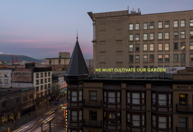
We Must Cultivate Our Garden, Nathan Coley, 2012 – studionathancoley
Like A Place Beyond Belief, this links to the theme of being united with the use of ‘we’. To me, I think it suggests that we must work to make the world and ourselves better. As a result, maybe Coley is commenting on how we are destroying our world and should strive to change this.
As well being an example of contemporary art, Coley’s installations are also forms of visual communication. The fact that he chose to create large textual structures in capital, block letters suggests he thinks it’s an important message that he wants people to see. Photography is also vital to the scope in which his work can be seen as there are limitations to site-specific art. Photographs allow it to be viewed globally and aren’t time-bound like a temporary installation.
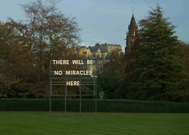
Looking at various examples of Coley’s work, it’s clear that he has certain motivations. For example, he regularly uses large infrastructure and light up text installations to allow his messages to be seen. Also, the text he uses is open for contemplation and interpretation – an important feature of contemporary art. Clearly, he uses his work to comment on more serious and controversial topics like politics, religion and social divides but overall I think the main message is that he wants people to strive for something better.
To research the use of text within art, I was prompted to read an essay on Language from the Tate, here are some notes I took from this:
Use of written/spoken word significant since early twentieth century
Text traditionally shown through authorship (signature)
Appropriated words, letters & symbols used to reflect avant-garde movements
Printed word became more common in urban landscape through development of marketing & advertising
Text/language became crucial for artists challenging notion that artwork is not just a physical object
Conceptual art established as movement in late 60s/70s and language was central for many artists
Viewers invited to engage with intellectual concept
Increased interaction between artwork and reciever
Prominent in Pop Art – use of mass media and advertising
Text often used to make statements – political, environmental, social
Art, poetry and literature combined
Artists mentioned:
Francis Picabias – ‘The Fig Leaf’ (1922)
Kurt Schwitters ‘ ‘Mz 299’ (1922)
Ed Ruscha – ‘Dirty Baby’ (1977)
Lawrence Weiner – ‘Tied Up In Knots’, ‘Roughly Ripped Apart’ from Artist Rooms Collection (1988)
Bruce Nauman – ‘La Brea/Art Tips/Rat Spit/Tar Pits’ (1972)
Martin Creed – ‘Work No. 890: Don’t Worry’ (2008)
Mario Merz – ‘Che Fere?’ (1968-73)
Jenny Holzer – ‘ Blue Purple Tilt’ (1996)
Joseph Beuys – ‘For the lecture: The social organism – a work of art, Bochum, 2nd March 1974 (1974)
Richard Long – ‘In The Clouds’ (1991)
Ian Hamilton Finlay – ‘Sailing Dinghy’ (1996)
Cy Twombly – ‘Souvenir de L’Ile des Saintes (1979)
This essay was quite useful, it’s evident that text is significant to art, especially in contemporary art, when trying to promote contemplation or to put across a certain message. I’ll probably come back to it and would like to look at some of the artist’s featured more closely.
For the second part of this section, I found another piece at the Originals Art Gallery as I wanted to find something that was fairly local to me.
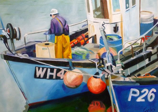
Weymouth and Portland Fishing Boats at West Bay, Sean Curley – Poole Originals
My initial thoughts about the piece is that again, it’s quite colourful yet it’s more muted down from Sue Smith’s painting. Also, I’d say it’s not as stereotypically ‘aesthetically pleasing’ since the subject of fishing boats is more practical. However, it’s definitely more of a commercial style rather than something that’s conceptual. Despite this, I am still intrigued by it. Some questions I had about it include – when was it produced? who is in the photo? what is the history behind it? and how personal to the artist is it?
It was produced by artist, Sean Curley. It doesn’t have an official title but is referenced as ‘Weymouth and Portland Fishing Boats at West Bay’. Similarly to the previous piece, I couldn’t find much information so again I reached out to Curley and he kindly provided some background information.
It’s an oil on canvas that was painted around 15 years ago as part of a collection for an agent or gallery, most of which are based on photographs taken from Weymouth Harbour and West Bay. Curley had painted a lot of colourful floral studies and was asked to paint another colourful subject that preferably contained a lot of blue. I’d say it’s pretty common to immediately associate the colour blue with water, particularly the sea and I guess that’s because a lot of people find it calming and visually pleasing.
In terms of linking to place, it is produced from a photo of a physical location and allows the place to be shared with people who may have never encountered it otherwise. This leads on to the idea of familiarity and a sense of place. This location is local to Curley so there is an element of knowing it and potentially associating memories with the location, therefore creating a sense of place for him. By painting it and not giving specific details, it allows the audience to wonder and contemplate the location and should they look into it, it may result in them becoming more familiar and deeming it as an actual place.
I’d say the theme of time is also apparent as it captures a place at a specific time since it was painted from a photograph. It’s quite interesting to be able to look back and see how locations change, in fishing towns like this it’s actually quite common for things to remain the same since it’s an industry many people rely on. However, overfishing has become a significant problem which may result in the use of fishing boats decreasing, therefore making this piece something that may not be able to be replicated as time passes. This is an example of how we become more educated over time and how society changes. Technology has improved and overpopulation has become more apparent, overfishing is a direct result of both of these things since technological advances and more people have meant fish are caught at a much higher rate. This conveys how time can affect place as the fishing boat shown in this piece may not be allowed to function in the future if overfishing continues to be a problem.
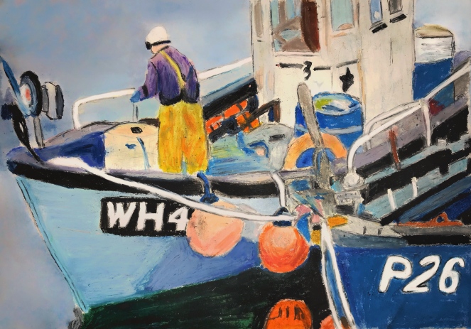
Like the piece I studied for Sue Smith, I also sketched and then produced my own version of Curley’s work. I didn’t have an oil based paints so instead used oil pastels.
Unfortunately, I don’t have any big galleries locally to me but I was able to look at some artwork on display in Poole, Dorset in the museum and the Originals Art Gallery.
One of the pieces I was drawn to is ‘Trees at Pelhams’ by Sue Smith, an artist, printmaker and demonstrator. It’s a mixed media pieces trees and surrounding landscape – made up of watercolour, acrylic ink, lichen and oil pastel. Smith commonly features nature in her work and does a lot of landscapes, as well as some Still Life pieces that usually feature flowers which you can find on her website, here.
In contrast to a lot of the art I’ve come across in this course so far, I feel like this is a much happier looking piece. It’s very colourful and visually pleasing, however, nature also makes me feel quite calm as well and looking at it in person made me feel positive. I’m also intrigued by it because it doesn’t give too much away in regards to the backstory and I wondered if it was a physical place.
There wasn’t any information in the gallery which made it difficult to understand the piece, however, I think that allows you to develop more of an opinion of it yourself. As it’s quite bright and colourful, I assume that it’s a place the artist is quite fond of and perhaps somewhere they’d like to share.
As I couldn’t find any context online either, I actually reached out to Sue Smith herself and she kindly filled me on some details. It is, in fact, a real place – the park and grounds at Kinson Community Centre in Bournemouth and was produced about 4 years ago as part of a demonstration for a club she is now chairperson of!
Obviously, this piece links to place quite well in the sense of it capturing a physical location, however it also conveys a deeper sense of place. The painting is personal to the artist and displays a place they know and associate with certain memories, even though the viewer may not be familiar with it they are able to get a feel of it from Smith’s piece. For instance, I would imagine it’s a calm and enjoyable place to be and the piece makes me want to visit.
I also think there is an element of time shown too as it literally captures the place at a certain time. Nature and the environment is everchanging so if someone was to visit this exact spot 10 years down the line, it may look very different. As a result, it conveys how time passes and constantly affects our world and the places we are familiar with.
I also did my own painting of Trees at Pelhams by Sue Smith using watercolours.
As part of a research task, I looked at Vatnajokull by Katie Paterson. The piece is a site-specific sound installation consisting of a live phone line that is connected to a microphone in order to share the sounds of the Vatnajokull glacier in Iceland melting. Paterson displayed a neon sign that depicted the number (07757001122) alongside three photos of the glacier.
Before beginning my research properly I created this mind map to plan the things I hoped to find out and explore further. This is a quick way to visually see what I need to research and the questions I’d like to answer in my analysis.
I think that her various choices of media make the piece that much more interesting and engaging. Even the neon sign is attention-grabbing and the element of mystery about what you would hear if you called it fuels people’s constant curiosity of the world. She actually added a book with the numbers of 10,000 people who called the line – which just shows how much of an impact it had. Should, she just have simply displayed the photos and featured the number in a small caption it probably wouldn’t have been as popular, however, a large and random phone number being shown as art is unusual and therefore I think the initial media is as significant as the sound installation itself.
Before listening to a recording of the piece myself, I was definitely intrigued to hear what the melting glacier sounded like as there is something fascinating about the unknown. The sounds of the melting ice do essentially sound like you’d expect (large things breaking and splashing in water), but it is calming in a way and is something I’d expect to hear in a relaxing background piece of music. Whilst the sounds are captivating, there is a bittersweet element since it’s a reflection of how global warming is affecting and changing our environment.
Paterson brings a sense of place to people by making the sounds accessible as it’s unlikely that many people would have visited or experienced it without this piece. She also conveys how the environment is changing, making you realise how places, as we know them, are temporary since there will always be different physical and human factors that bring about change in some way. She gives this particular place significance and importance by utilising our senses – we can visualise and hear Vatnajokull which allows us to become somewhat familiar with it even though we aren’t actually there. It also links to place since it is site-specific, you wouldn’t be able to hear the specific sounds of this glacier melting if the microphone wasn’t installed and therefore her decision to make this glacier art is important to the overall theme of place.
The theme of time is also demonstrated through the installation. As time passes, more of the glacier melts which highlights the impact of humans on nature over time. Environmental issues like global warming are getting worse over time and Paterson’s installation forces you to consider the effects of time on the environment and how the world we live in may look in the future. Although time is a concept that we can’t control, this shows that it can be portrayed in different ways.
The concept of place is also very prevalent in her other work, she often focuses on space and tries to make sense of places we don’t understand or can’t experience. For example, her piece Ancient Darkness TV consists of a minute video showing darkness 13.2 billion light years from Earth. This occurred just after the big bang and it the furthest point of the observed universe. Personally, this prompts me to think about how small the places we’re familiar with and Earth itself are in comparison to the universe, but also how time constantly affects place.
Melting glaciers is also the feature of another of Paterson’s work – Langjökull, Snæfellsjökull, Solheimajökull. The sounds recordings from the three glaciers are pressed onto records, then cast and frozen using melted water from the corresponding glacier. The ice records were then played on turntables until they completely melted away. This allows you to hear the glaciers melting but also the sounds of the needle and the record itself. This symbolises the effects of global warming through the visual and audio representation. Again, the passing of time is demonstrated visually from the melting ice records and can be measured by how long the sounds play. A sense of place is portrayed because she allows the audience to interact and experience a place they’ve never been to and combines the sounds of melting ice from the past and present.
Looking further into the essay: Place – The First of All Things by Tacita Dean and Jeremy Millar, here is a list of some artists referenced and a few pieces that I found links to the theme and concept of place.
Vitaly Komar
Alex Melmaid
Jacob van Ruisdael
William Blake
Caspar David Friedrich
John Constable
Ian Hamilton Finlay
Douglas Huebler
Robert Smithson
Dan Graham
Joachim Koester
Doug Aitken
Jane and Louise Wilson
Roni Horn
Alexander and Susan Maris
Graham Gussin
Mette Tronvoll
Marine Hugonnier
Guy Moreton
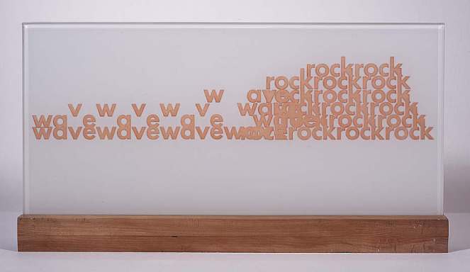
Wave Rock, Ian Hamilton Finlay, 1966
Finlay was often inspired by the sea, boats and fishing and this piece represents the movement of waves crashing against rocks. In a way, this provides a sense of place by allowing the viewer to imagine this process and bring it to life in their mind.
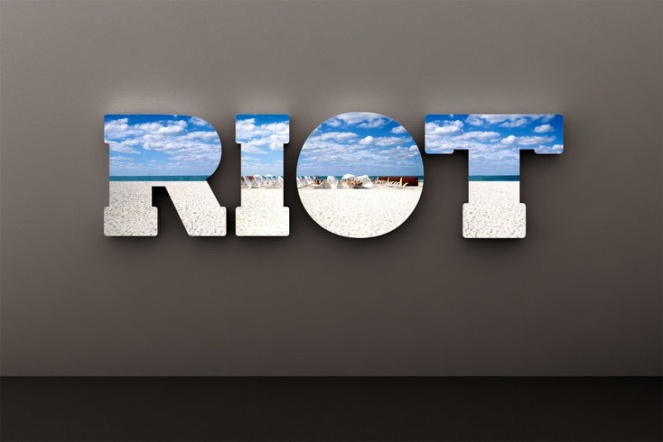
Riot, Doug Aitken, 2011
Here is an example of how we have certain views of particular places. This piece depicts an image of a beach within an LED light box. We associate a beach landscape with being calm and peaceful, yet the word riot juxtaposes this with connotations of chaos and often violence.
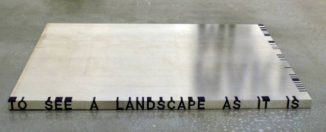
Thicket No. 1, Roni Horn, 1989-90
This piece is all about perspective, from the top you simply see black lines, however, from one side you can read ‘to see a landscape as it is’ and the other reads ‘when I am not there’. This promotes the idea of looking at things differently, something that can help you understand place better.
I read over ‘Place – The First of All Things’, an essay by Tacita Dean and Jeremy Millar in full and then went a read back certain bits that stuck out to me in more detail. Here are some notes I made on the piece:
Place is difficult to locate or define and has been throughout time
It’s not just simply geographical
Importance recognised in anthropology, architecture, ecology, feminism, globalism, literature, mathematics, music, psychology, urbanism and art
We would be lost without it
Often used as a synonym for ‘space’, ‘location’, ‘site’ or ‘territory’
‘Place is to landscape as identity is to portraiture
Term landscape didn’t exist in Dark and Middle Ages, typical features of landscape were but weren’t looked at collectively
Landschaft – Landschap – Landskip (cultivated land surrounded by unknown wilderness, eventually recognised as views of rural scenery)
Does landscape exist if there is no one to look at it?
Like time, we are familiar with place and engage with it every day but don’t understand it properly
‘A place for everything and everything in it’s place’ – Samuel Smiles and ‘a sense of place’
‘When space feels thoroughly familiar to us, it has become place’ – Yi-Fu Tuan
Place can be personal and interpreted differently to each person (like art)
‘places remember events’ – James Joyce
Historical events often known by place they occurred (Hiroshima, Chernobyl, Auschwitz)
Many places within a place, many regions – each with own identities
If something is in a certain place it ‘occupies such a position relative to other things’ – Descartes
Reduced to position/site or simple location
We have a strong sense of place and a strong sense of belonging (place as a concept)
Common to fight to protect places of importance (subjective)
Art and place hold similarities – both down to interpretation, much more to it than what we first see, many types of art and place
both need ‘a little time, a little patience, and no little sensitivity’ to be aware and open to what else it is
This was a complex essay that covers various aspects of the concept of place but I definitely think it’s a useful piece of text as an introductory to the subject. There are certainly aspects that I agree with – for instance I do think it’s true that when somewhere becomes familiar to us and hold memories we regard it as place. Also, I think it definitely links to both time and art, just with our struggle to define them as concepts alone. I’ll most likely come back to this essay throughout this section as I’m sure it will prove useful to the exploration into place and with academic texts like these, you will often read them multiple times and focus on different aspects.
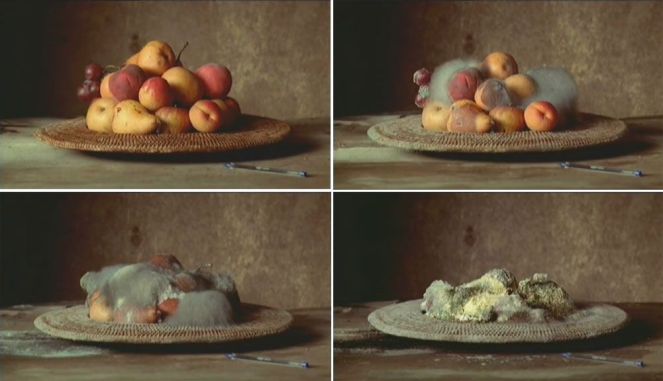
Screenshots from Still Life, Sam Taylor-Wood, 2001 – pinterest.com
Initial Reaction
Sam Taylor Wood’s Still Life is a video time-lapse that depicts a bowl of fruit decaying. My first reaction to it was mostly one of disgust since mouldy fruit isn’t exactly aesthetically pleasing, however, it’s also weirdly fascinating. I do wonder where this was done as it’s not something you’d want in your house that’s for sure.
Media and Form
Fruit is often used in art, though this is a different take on it – I think the fact that she chose something natural reflects how we can’t control the decaying process and in a way, this also links to the inevitability of death.
Still life art is usually a stationary piece of art like a painting and this could have been done in a series of paintings too. The decision to do this as a time-lapse in video form allows you to physically see the decaying process and how time affects it, which I feel prompts more of a reaction.
Context
This piece resembles a Vanitas painting since fruit is a common symbol for the pleasures of life. Similarly, the decaying process links to the theme of death and mortality that is significant to Vanitas art. The juxtaposition against the natural fruit decaying and the plastic pen remaining in good condition is a reflection of the environment and world. These artificial items will be the things left when we are no longer here since no living thing can escape the inevitability of death.
Taylor-Wood also has another time-lapse piece that shows a dead hare that gradually decomposes alongside a peach. Again, this shows how fleeting biological life is and forces the idea of death on us. I immediately think of Damien Hirst’s work with regards to this theme – the shark in particular as he also puts death on show like this and forces the audience to contemplate the control it has over living things. Tacita Dean is another artist that physically shows the passing of time with the use of nature (mosquito, birds, baby crying).
Time
This piece links to time since the choice to use video means you can literally see time passing and how it causes the fruit to decay. In a wider sense, this conveys how short biological life actually is in regards to how much time passes within the universe.
__________________
I wasn’t overwhelmed by the time-lapse, without knowing it’s a ‘piece of art’, I wouldn’t call it one – a similar reaction I had to Hirst’s shark. I think Taylor-Wood wants us to contemplate complex themes like death, decay and time, rather than being as direct with a dead shark she uses something delicious and aesthetic. You can’t help but watch the decaying and essentially death of the fruit alongside the mould taking over and coming to life, showing the effects of time and how living things can’t withstand it. The pen seems random but when watching the video it’s condition doesn’t deteriorate and you face the reality of our environment and how these artificial objects that we control are what will remain when time and death takes control of us.
It’s interesting to see how the fruits decay at various rates which is much like other forms of biological life. As humans, we all meet an inevitable death but have no control over the time it takes. Sometimes you see people’s health deteriorate (like the fruit) but often this isn’t the case and we’re reminded of our mortality and how fleeting life can be.
With contextual information, I do have a better understanding of it. By choosing to declare this as a work of art, it makes you stop and question why and what it’s representing which is powerful and the purpose of all art – the artist wants you to experience and have a reaction to something, what that is, depends on the viewer.