Assignment 5 · Research & Reflection

Feedback from Assignment 5

An immediate improvement for this assignment would be to ensure I provide an introduction that outlines the line of discussion clearly. Whilst I think introduced Do Ho Suh’s work, I perhaps didn’t highlight what themes and ideas I would intend to look at in the essay.

My tutor also commented on the fact that I should ensure I start each paragraph with my own statement or opinion, rather that a quote. Instead I should follow it up with a quotation in order to back up my point.

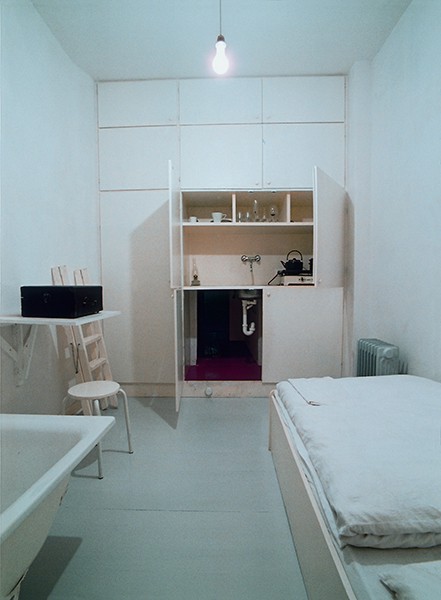
Early on I acknowledge that Suh comments on concepts of space and home in his work, however I could’ve expanded on this further. For instance, one aspect of these themes that interests me is a sense of place and belonging. This feeling is usually created when we become familiar with a space and develop an emotional connection. A home is probably one of the most personal spaces to an individual which is why Suh’s work is so relatable. He shares a representation of the spaces he called home during his life and takes us on a trip of these various locations. This allows us to reflect on the places and homes we may have lived in, obviously this varies depending on experience. Some people may have only lived in one location whereas others may have moved multiple times, for both positive and negative reasons. This links to the idea of ‘rootlessness’, a term my tutor highlighted, which was used by Stalin as a term of denigration. It is something I’d definitely look into further when thinking about Suh’s hubs again.

In order to develop my essay further my tutor suggested I consider both social and aesthetic aspects of a home. For people that are homeless, a home would offer a solid, private house. Therefore it is probably more about function and safety, than the nostalgia created by memories and experience.

I would also consider the title ‘Passages’ more closely. The meaning of connecting places obviously makes sense in reference to Suh’s hubs as it allows you to travel to the different homes he lived in. However, as my tutor pointed out, the term can also be associated with sea-voyages, such as the Middle Passage in reference to the Slave Trade. If I was to look at rewriting this essay, I would ensure that I gave more thought to why he might have named the installation ‘Passages’.

My tutor also identified that I have looked at other textile artists and wider themes of fashion and textiles in my learning log. To expand on my essay I could have compared Suh with some of my wider research. Looking at it now, there are similarities in Christian Boltanski’s installation ‘Personnes’ (2010). Like Suh’s hubs, this is a large installation that transformed the space it was displayed in. However the connection between the two is more about the personal aspect. In Boltanki’s installation, he uses the sound of heartbeats and each one is unique to a person. The pile of clothes also represent people, symbolising someone’s life and story. Therefore there is an emotional side to his work, like Suh’s. In Passages, the hubs represent the homes he inhabited and the stages of life.

You could also compare Suh’s hubs with Yayoi Kasama’s ‘Infinity Mirrored Room’ (1998). Both installations are immersive and due to the bright colours, it’s like you’re being transported from reality and to somewhere other-worldly.

Suh’s Passages comment on the importance of a home – both the function and mental health aspect – often improved by a feeling of belonging and connection in a familiar space of safety. You can also think about wider issues such as sustainability, when building homes you need to consider where the materials are sourced, as well as the use of machinery and electricity, It can be done sustainably by working with the environment more – like using renewable energy sources but this is something that still needs improvement in the building industry.

Assignments · Coursework · Research & Reflection

Conclusion

Looking back on my experience of the CAT course, it’s clear that my research skills and confidence in discussing the information has improved greatly. In my opinion, I feel like my later work, particularly my assignments, show an ability to research wider themes and concepts which help me to form a more critical analysis.

Research is an integral part of all learning and is a skill I have and will keep improving throughout studying with the OCA. The ability to utilise different resources – both primary and secondary allows you to gain a better understanding of the subject, whilst allowing you to refer to wider themes, concepts and theories.

I always ensure I dedicate a large amount of time to the research I put into my work, perhaps too much time sometimes but without this research, I wouldn’t feel as confident in commenting on a subject as complex as the creative arts. Often I found it beneficial to create a mind map, outlining my initial thoughts and the areas I wanted to research further. Doing this helped me to collect my thoughts before collecting both primary and secondary research.

Visual research and investigations are just as important as the theoretical, especially in such a visual course like Creative Arts Today. I find that they prompt more contemplation because the information isn’t necessarily as obvious to it causes you to think about the subject on a deeper level. Often it may represent various concepts and themes already mentioned in other research but seeing it visually can help you to understand better or consider it from different perspectives. I think this is particularly important in a creative course because there often any wrong or right answers in art – it’s subjective and can mean something very different for each person.

You can then research the potential themes, symbolism and concepts further to develop your knowledge and gain a better understanding of context. This may be about a movement, other artists/designers, characteristics of someone’s work etc.

To begin with, I found it challenging to ensure that my points were backed up by a reference in any assignments. Although I’d done extensive research, I perhaps hadn’t organised it enough and written down the sources in which I found the information clearly. There are stages to research and the organisation of it is vital to ensuring you are able to build a well thought out essay.

Upon reflection of the work I’ve explored and analysed during this course, there are definitely some themes and concepts that are more common. Place and Time were obviously running themes but in addition, I found that concepts such as life and death could also be linked to many of the works I looked at.

Therefore, theoretical research is important and can help you to understand why an artist, writer, photographer or designer may have made a certain choice. However, it is the visual research that what develops your own opinions and connection to the work.

Assignment 5 · Research & Reflection

Assignment 5: Research

There were two prompts for this assignment and I opted for this one:

‘Select an art installation where its primary medium is considered a textile. Analyse its formation and contextual presence; question the creation of the piece and if it has been informed by the space it inhabits or if there is no connection and the gallery/environment is a secondary component.’

I decided to look at Do Ho Suh’s ‘Passage/s’ for this last assignment.

IMG_3479

When researching and planning for any essay I always prefer to write down my notes before typing anything up. I find it easier to collect my information so that I have it to refer to when starting to write my essay and always highlight the key details to ensure I include them.

I attempted to arrange my notes as best as I could – for example, I wrote down my initial thoughts, the physical properties/qualities of the textiles and then looked at the work in regards to wider themes and concepts.

IMG_3480

Below are my notes for my reflective commentary about Part 5 as a whole, including my initial thoughts and the parts of the Textiles content I enjoyed most.

IMG_3481


Part 5 · Research & Reflection

Fashion garment analysis

For this exercise, I chose to use this image of Gisele Bündchen in a Balenciaga grey silk cape by Nicolas Ghesquière. Photographed by David Sims for Vogue, 2006.

Mind Map (1)
Image credit: https://www.vogue.com/article/masters-of-the-house-a-look-back-at-balenciaga-in-vogue

What are the textile qualities present? 

Silhouette: The garment is a cape so it’s designed to be loose and free moving due to excess fabric. Not figure hugging and cuts off above knees. The rest of the outfit is more fitted and in a simple black to keep attention/focus on top half of the models body, and the garment itself.

Volume: Ghesquière plays with volume through the pleating of extra fabric to create a cape and almost balloon or parachute effect. The volume conveys that the material is light and able to float/move.

Drape: The cape appears fairly effortlessly draped over the models body due to it being aingle layer of material. Furthermore, there is little rigid structure.

Movement: The excess material allows movement because it isn’t tight fitted or structured, instead it’s more free flowing. The model appears playful and David Sims is known for his candid poses that capture more dynamic movement and in this case, also creates lift from the cape.

Colour: Due to the cape being a neutral grey, the colour is very minimal and subtle. Also, the other accessories are black, against a grey background. The silk fabric looks sophisticated and elegant, almost with a metallic effect due to the sheen of the silk.

Print: This wouldn’t be a garment picked out for the use of print however, if you look closely there are some lines that add texture to the silk.

What is the context of the garment? What is the image for?

The garment itself was part of the Balenciaga Autumn/Winter Ready-To-Wear collection, 2006. In this Vogue article by Sarah Mower she highlights how Ghesquière created ‘extraordinary volumes’, ‘new proportions’ and a ‘powerful modernity’ – reflecting 1950 couture. For this particular photo of the garment, Gisele Bündchen was photographed by David Sims in New york, July 2006.

How does this affect its appearence and focus?

Whilst I don’t know what intentions David Sims had for this photo, his definitely highlight the volume and movement or the cape. The idea of ‘powerful modernity’ fits the styling and composition of the photo.  The neutral background and candid/action pose showcases the textile qualities and the model still appears elegant but playful and modern.

How do you relate to the image?

Gisele Bündchen looks elegant and sophisticated but also powerful, important and busy which I think creates a healthy portrayal of women. It’s certainly a fashion photo that I find more interesting and dynamic than some traditional model poses and they can sometimes appear vacant or too ‘perfect’. I think David Sims manages to showcase the garment and model in an engaging way that makes it a more aesthetic image to me.

Is the model important?

The particular pose is important to the overall effect of photo. The model has to understand the garment – it’s textile qualities an how it moves, as well as working with the photographer to create a successful photo. It’s possible that some people couldn’t achieve the desired candid and playful pose while still looking elegant and keeping focus on the garment.


Part 5 · Research & Reflection

Print and Patterns

When thinking about high street brands that are characterised by their use of print and pattern I instantly thought of Cath Kidston. This was a brand that was very popular whilst I was at secondary school so I became familiar with a lot of their prints and patterns, especially the floral ones since I think that is what they’re best known for. Other similar brands include Emma Bridgewater and Orla Kiely. Another designer brand that came to mind was Louis Vuitton, it’s not something you necessarily see as often since it’s a more luxurious and expensive brand. However, the Louis Vuitton logo is easily recognisable as one of their most popular design patterns, particularly on bags.

Orla Kiely multi-stem fabric, tomato and Emma Bridgewater Polka Dot Serving Plate – johnlewis.com and abraxascookshop.com

Do you think it is primarily about aesthetic considerations or is it an attempt to create an identifiable brand?

I definitely think that the aesthetics of these prints and patterns are a significant part of the brand. The designs have to be interesting, different and should fit the style of the brand. Cath Kidston is known for vintage and typically floral prints, it is often described as being quintessentially British so therefore a bright neon or stark black design wouldn’t necessarily fit the aesthetics of the brand and what customers like. An important factor of the aesthetics is the marketability. Creating an identifiable brand helps this because the prints and patterns become recognisable and more desirable. Like many other fashion designer brands, the Louis Vuitton monogram has also become a symbol of sophistication, luxury and wealth – making them one of the most popular fashion houses today.

Cath Kidston Stanley Mug and Alma PM Louis Vuitton bag – cathkidston.com, uk.louisvuitton.com

By doing this, these brands have been able to take their familiar prints and pattern to produce various products such as fashion accessories (bags, purses etc.), household items (mugs, beauty products etc.) as well as fashion pieces.

Mary Katrantzou 

  • Greek fashion and textile designer – born to a textile designer father and interior designer Mother
  • became known for her busy prints – often give the effect of being intoxicated
  • her prints are seen as art themselves so are highly collectable
  • garments are uplifting, fun, beautiful and flatter the weather despite the dynamic prints
  • she has always been inspired by women for her work
  • takes placement to an extreme level
  • uses contemporary digital print technology
  • designs garment shape and cut at the simultaneously with the print design – achieves unique compositions and interesting optical effects on the body
  • digital print technology allows photo-realistic images to be printed directly onto textile substrates using a CMYK print process
  • pushes print to the limit and questions if there is a limit

I also read up about her ready to wear Fall 2011 collection – https://www.vogue.com/fashion-shows/fall-2011-ready-to-wear/mary-katrantzou

Tim Blank writes about how Mary Katrantzou wanted this collection to be more about the woman in the room, rather than the room on the woman like her tour de force interior-exterior decoration.

She describes the collection as being more fluid/real – in a way very lively and dynamic way that is. Katrantzou imagined the woman as a connoisseur -surrounded by objects of beauty – Fabergé eggs, Meissen porcelain, Cloisonné enamel and Ming vases. This helped to create hyper-vivid, colourful prints. The silhouettes in this collection were inspired by the haute couture wardrobes of their imagined owners. Legendary style icon names like Diana Vreeland, Babe Paley and the Duchess of Windsor were mentioned. She also used a softened silhouette which added a new layer of interest and was for any woman who went to wear her work, rather than hang it on a wall.

What do you make of the article’s reference to ‘the room on the woman’ and ‘the woman in the room’?

This collection focuses on the woman and how textiles are used to compliment the body and allows you to see her garments as art, rather than focusing on the collection as a whole in the room. Each women is highlighted as unique, special and beautiful – and not just a surface to display the garments.

Anna Schilling and Imogen Newton, wearing Mary Katrantzou, 2011 – vogue.com


Part 5 · Research & Reflection

Chanel’s use of tweed

To start this research I was asked to first look Chanel’s Autumn 2013 ready-to-wear collection, which you can find here.

The clothes in the collection were dark with the key silhouettes being streamlined – one favourite ‘was fitted to the hip, then flared into a short skirt over leather cuissardes’ and another was ‘cut high on the thigh at the front, dipping to mid-calf at the back’. A large dark globe revolved above Karl Lagerfeld, although it was as if it was nighttime (matched by the dark palette of textiles used), it was not depressing. A metallic thread was woven through the pieces and the tweed shined and I think there is a cosmic and otherworldly feel to the collection.

This image below shows the way in which Chanel explores different designs, fibres and composition to update and bring something new to the traditional tweed. The metallic thread and black velvet ribbons create an interesting effect, it reminds me of armour or again something very futuristic and space-like.


Senait Gidey photographed by Yannis Vlamos for Chanel, Autumn 2013 – vogue.com

I then read this article from Elle: https://www.elle.com/fashion/news/a15402/the-story-of-chanels-tweed/

Chanel is known for iconic tweed pieces like their dresses, jackets and skirts. The use of the fabric was first inspired by menswear after Chanel borrowed sportswear and found that it would lend itself well to her designs. It’s comfortable, supple but has a sophisticated look – something the Chanel brand is known for today. From 1924, the tweed fabrics started production in a Scottish factory and Chanel chose colours that were inspired by the Scottish countryside. Quickly becoming a popular look, especially in Parisian couture houses and she began using a factory in Northern France during the 1930’s. It was here that she started mixing the classic tweed fabric with silks, cottons, wools and sometimes cellophane which made it more lightweight and gave it a high fashion style.

In the 50s and 60s the Chanel tweed jacket became a staple for those in the upper class – both in Britain and America. It was less restrictive and fitted more like a cardigan which offered the sophisticated and fitted style in a more comfortable structure. Jacqueline Kennedy is known for her pink tweed Chanel suit, she wore it multiple times during John F. Kennedy’s presidency but it is now infamous for being what she was wearing during his assasination in 1963. It has become one of the most referenced and remembered outfits and is arguably her trademark.

Pink Chanel suit of Jacqueline Bouvier Kennedy - Wikipedia
Pink Chanel tweed suit worn by Jackie Kennedy, pictured in 1961 – wikipedia.com

Still today, Chanel’s use of tweed is celebrated by those in fashion and other designers and retail business have experimented with tweed to offer more affordable pieces in order to achieve a similar style.


Part 5 · Research & Reflection

Fashion images

Below are some notes and images relating to some famous fashion photographers:

Irving Penn

  • simple, sophisticated
  • showcased clean lines & tapered waists of postwar Paris and New york
  • transformed aesthetic of the fashion industry
  • removed everything from shot besides clothing and model
  • inspired by Surrealism, Modern dance, film noir
  • makes provocative visual statements, not just commercial
  • firm grasp of the body, consumerism and the history of art
  • bridged gap between fashion photography cat
  • known for iconic Vogue covers
  • also known for his – ‘corner portraits’ in which he put celebrities into tight corners in awkward poses – revealed unfamiliar elements of their personalities
Jean Patchett and Rochas mermaid dress, photographed by Irving Penn for Vogue, 1950 – vogue.com

Mario Testino

  • has become one of the best known/celebrated fashion photographers
  • work featured in Vogue, V Magazine, Vanity Fair and GQ
  • created image, for Gucci, Burberry Versace, Chanel, Michael Kors, etc.
  • luxury realism
  • intends to capture subjects in moments of engagement or expression – opposed to vacant, glassy-eyed aesthetic of his contemporaries
Cara Delevingne and Taylor Swift by Mario Testino, 2013 & 2015 – mariotestino.comvanityfair.com

Richard Avedon

  • portraits famous for minimalism
  • ability to put his subject at ease – helps him create true, intimate, and lasting photographs
  • black & white portraits – colour creates unwanted distraction commercial fashion
  • photographer groundbreaking fine art portraiture
  • one of the most influential photographers of the 20th century – ‘helped define America’s image of style and beauty and culture’ – New York Times
  • created innovative contexts – memorable images
  • the subject would often take up and most of the composition – appearing cropped
  • candid, emotive – expressive art form (photography)
  • signature white background – no context/story
  • subjects able to move freely – creates movement/spontaneity
Stephanie Seymour for Versace by Richard Avedon, 1993 – vfiles.com

Sarah Moon

  • known for soft, dream-like/fantasy and graphic images
  • unusual style but gained respect in the fashion photography industry
  • images have a focus on composition and shape
  • romantic and melancholy feel to images
  • often uses jewel tones
  • began modelling before starting fashion photography
Issey Miyake and Yoji Yamamoto by Sarah Moon, 1995 & 1996 – philips.commichaelhoppengallery.com

Is it art?

The relationship between photography and art is an interesting debate, some see photography merely as a tool. For example, it is a tool to showcase these dresses and the models wearing them. However, many would consider these photos art due to the choices made by the photographer. Avedon’s ability to portray movement and Sarah Moon’s choice of colours and graphic style are examples of this.

Furthermore, I believe all of these photographers help to elevate the garments – from the shape, form, colours and details to the textile qualities themselves. Photography also allows these dresses and the work of the designers to be seen on a wider scale so is valuable to the fashion industry.

Notes · Part 5

Layering qualities of textiles

I read pages 68-70 of Room Three: ‘Fantastic’ of Place (Dean & Millar)

Gregor Schneider’s ‘Totes Haus ur (Dead House ur)

Gregor Schneider - Kehrer Verlag
Gregor Schneider, Totes Haus ur, 2001 – kehreverlag.com

  • vacant apartment, Rheydt – continual alteration
  • a strange labyrinthine space that exists behind a tiled three-storey facade
  • walls built in front of other walls – changes are perceptible but unrecognizable because walls are identical
  • lined with a thick, sound-insulating material, like lead
  • alters the rooms’ characteristics in invisible ways oppressive atmosphere
  • windows built in front of other windows, lamps placed in spaces between – light floods through even at night
  • entrances are hidden behind walls, doors unable to be manipulated from the inside (loose handles)
  • intense spatial and temporal dislocation – suggests a moral one too
  • remind us of horror movies, news reports – should be wary
  • form of exploration of a greater collective memory
  • communities lost – those displaced by large scale ma strip- mining nearby – places haunted by those who once belonged there

Architectural Palimpsest

– a manuscript or piece writing on which has been superimposed on effaced earlier writing

– something reused or altered but still bearing visible traces of its earlier form

The following two quotes are from Architectural Palimpsest – Rethinking The Architecture by Juan Gatica – Which you can find here.

‘When reading architecture as a Palimpsest it can be interpreted in three ways: the former meaning, the new meaning and a hybrid interpretation’

‘An architectural piece from which, while subtracting, but maintaining the inherent qualities of the same, begins to define the design intervention from a completely different view’

Layering textiles have many purposes – they can cover, hide, envelop, disguise and transform an object, person and place. It can also change the perception of something – fully or partially, it may add/take away from the original and other layers or reveal something new.

Exhibitions & Books · Part 5

Christian Boltanski – Personnes

Christian Boltanski’s 2010 installation ‘Personnes’  

Christian Boltanski, Personnes, 2010 – photo by Didier Plowy – eva-albarran.com

Art or Design – Installation art, not functional and more about the contemplation it causes.  An example of contemporary art as it challenges the boundaries of art. The components only become ‘art’ when in the context of Boltanski’s installation.

Temporary or Permanent – Was open during January and February of 2010.

Large or Small scale – On view in the Grand Palais, Paris and part of the 13,500 square metre exhibition space.

Transforming and/or Defining and/or Forming – The whole space is used and transformed due to the large crane with a metal grabber, piles and the large mound of clothes, as well as the sound of heartbeats.

Immersive and/or Distant – Viewers can walk amongst the work and alongside the piles of clothes. It is a whole experience and not something viewed from a distance.

Pattern and/or Colour and/or Repetition and/or Shape – The installation uses the repetition of piles of clothes and street lights to form the grid shape and a large mound. Repeated audio of heartbeats is also used within the space.

Before answering the questions below I also read Laura Cumming’s article with The Guardian, which can be read here.

The noise of heartbeats permeates the exhibition, why do you think that is?

  • makes it a more immersive experience
  • links to the apparent themes of life and death
  • feels more personal (each heartbeat is unique to a person)
  • can be linked to the clothes (also represent a person)
  • adds deeper meaning and creates further questions – are the sound and visuals connected? What happened?
  • also adds emotion – heartbeats can be both joyful/comforting and eerie/sombre

To what extent are the textiles transformed into something other than fabric?

  • they are a metaphor for deeper themes – mortality, the inevitability of death, time etc.
  • they symbolise someone, a life and a story
  • represents the loss of lives and suffering

What’s the significance of the installation title and the mechanical grabber?

  • the title means both people and nobodies – represent people but they are anonymous and still unknown to us
  • highlights issues of status, people may be known in life but we are all the same at death
  • the mechanical grabber may signify chance or the ‘hand of God’
  • also links to the idea of time and how life is short
  • life and death is a continuous cycle
  • can also link it to consumerism and poor attitudes to waste – disposable

What associations does this work conjure up in your mind?

  • life and death
  • the loss of lives – particularly through violence, murder and diasters
  • makes me think about the holocaust, genocide and mass murders
  • reminds me that death does not discriminate
  • I also associate it with time and how we can’t control it or how much time we have to live (can manipulate and try but death is inevitable)