Part 4 · Research & Reflection

Kirsty Elson Research

What is their craft and how do they approach it in their work?

Kirsty Elson is a multimedia artist, however, she mostly creates driftwood sculptures. She usually collects the driftwood, other materials and found object from the beach. She is inspired by Cornish coast and her miniature cottage sculptures reflect this. Elson also uses some textiles to create her artwork – such as when making flags, deckchairs, clothing lines and other decoration that helps her sculptures to come to life. Her website can be found here.

Images from Kirsty Elson’s Twitter 

Do they adhere to the ideas of Slow Design?

Since her sculptures are all individually handmade Elson definitely follows the principle of longer processes – from the collection of materials to the final touches. Also, she reuses materials, including things that would otherwise go to waste. Therefore her sculptures work with the environment and encourage people to use materials in multiple ways.  Like products that are made using the principles of slow design, Elson’s pieces take a considerable amount of time to make and are generally more expensive than a mass-marketed product.

To what extent does this allow them to take risks, experiment and innovate?

Elson has her own business and can choose the pieces she sells, including when and how. This means that the pressure of making a certain amount is reduced and she can focus on quality and creativity. She has the freedom to experiment and be innovative because they are unique/one of a kind pieces. Kirsty had said that because each piece of driftwood is different, they will often give her new ideas and she is always finding new materials to experiment with.

By using found objects she pushes the boundaries of what can be perceived as art, generally you wouldn’t see driftwood, nails or textile scraps as anything other than what they are. However, Elson elevates them and demonstrates the vast possibilities of the textile and art world.

Images from Kirsty Elson’s Twitter 

Is their story or the story of their work important? Why?

Since her work is inspired by the place she lives there is a sense of nostalgia, also I think many people have experienced a seaside holiday or visit so we are familiar with the small cottages that she depicts. Also, because she uses things people may have left on the beach, it makes you wonder about the stories behind these found objects. Elson definitely creates a sense of place with her work, particularly in regards to coastal living due to the small, weathered but aesthetic cottages she creates. Although she tends to prefer using her surroundings as inspiration she has made more specific pieces in the past. For example, a lady asked her to re-create pub the pub in which she met her husband, which obviously adds a special story to the piece. Each sculpture is created by Elson in her home and you can tell the time and effort that went into them. Also, you can imagine the journey and processes – from finding driftwood on the beach, being inspired by ideas to the building and addition of finishing details. You can listen to her talk about her work more here.

Do you value ‘craft’ and craftsmanship? Why or why not?

I definitely value craft & craftsmanship because I appreciate the creativity and of course the shows time and effort that goes into it. I think it shows a real passion and dedication, as well each item being more thoughtful than something mass-marketed. People who use craft in their work means that the final product is more unique and therefore often more special so it should be valued.

Is there room for craft in modern society?

Whilst I do think there is a need for the mass production of some things in order to produce the number of resources that are required, I also think there is room for craft in modern society. Due to technology advances, it is increasingly easy to produce things in large quantities which means they are often simpler in design and less special. Therefore I think we now appreciate craft and craftsmanship more since it’s something we don’t see as much. I tend to associate craft with decorative, gifts and special pieces because they seem more thoughtful and unique. Overall, I think it’s just important to support creativity.

Part 4 · Research & Reflection

Details in Photography

It’s not just viewpoints that can affect how place is shown through photography. You can also consider boundaries, peripheries and transitional geographical sites.

Looking at pages 172/173 of Room Eight: Heterotopias and Non-places in Place (Dean and Millar), I thought about whether a place can exist in a state of perpetual change.

It’s true that there are many locations and sites that are ever-changing – somewhere along the coast that is at risk of being reclaimed by the sea, a building site or empty airport. Often these places are a visual representation of time passing and how things change over time.

English artist, Stephen Hughes has taken photos of ‘on the edge’ places. Many of his photos feature entropic spaces, highlighting how things can change from a state of order to disorder.

I think place can definitely exist in a state of perpetual change, it may not be somewhere that always remains the same and often the familiarities may differ. However, I think this adds to the interest of a place and gives it a history that can be contemplated. Photos of places in a state of change will often be unique and allow you to think about wider concepts – such as time.

How photographs are shown to the viewer affects how they are received – there are various ways of getting the viewer to focus on particular details.

Bernd & Hilla Becher, Water Towers, 1980 – mfah.org

Bernd and Hilla Becher are known for repetition of the same matter, which they often display as a grid of images. The photos appear similar/the same, yet they are all different in some way. This allows certain details to be emphasised. It’s interesting that we often look more closely at something when looking for differences and comparing photos, rather than simply looking at a single image.

Below I have created my own grid of images. I chose to take photos of a tree because there are similarities between all trees yet each one is individual. Furthermore, you can also see the details and differences of a specific tree when looking at it from different angles, perspectives and viewpoints. For instance, when further away you can see the overall shape and height of the tree. However, when you get closer you can see the different textures better. Some of the photos of the branches look fairly similar but as you look closer you can see how they have grown in different directions and heights. The more you look, the more you notice about the intricate details which I think makes the photos more interesting than if you were to only look at a single photo of the tree.


Part 4 · Research & Reflection

Viewpoints in Photography

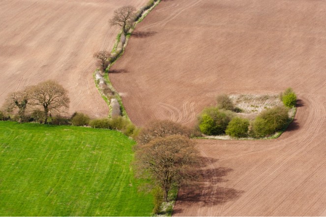
Derek Trillo, The Cheshire Plain from Beeston Castle (2008) 

fieldview

  • gives you a wider view of the landscape
  • can see the difference in the fields – terrain and colour
  • can various trees from above – usually can’t see the tops of trees from the ground level
  • the angle of the viewpoint allows you to see clap shapes/height better
  • can see lines in fields – details not necessarily visible on a map
  • trees – seem to form a pathway through fields and divides them

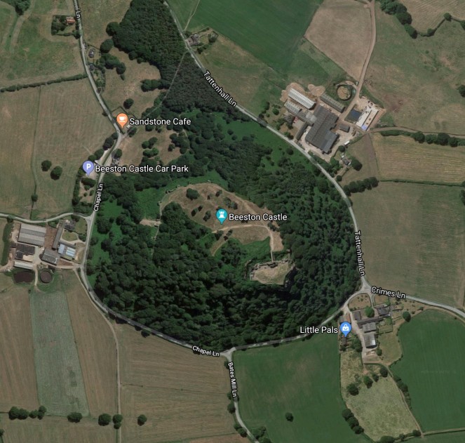
Google Maps

map


  • changes regularly (updated) – different from the original photo, taken in 2008
  • provides an even wider view of area and landscape
  • additional information shown on the map – like cafe, carpark etc.
  • can see roads, buildings and castle from above
  • bird’s eye view – directly above so can’t get an idea of height/structures due to everything appearing in 2D

Ground view

  • more realistic of what we normally see
  • close up new – can see details
  • gives a better sense of height/depth in comparison to us
  • can’t necessarily see other facilities in the area
  • more interesting and varied levels/depth

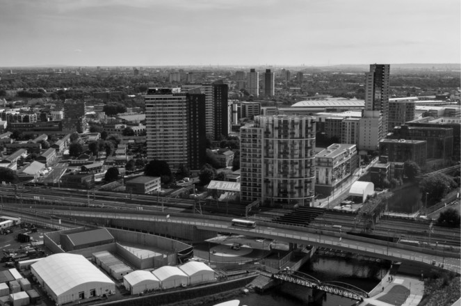
City photo by OCA student, Peter Mansell 

cityview

  • good sense of depth – can see the height of buildings in the foreground and can also see them decrease in size in the background due to distance
  • shows varying level/heights
  • clearly in a busy city – urban, built up
  • can see roads, bridge and body of water – good sense of cityscape

Map (not sure where it is from original photo)

  • gives a better view of surroundings – would provide additional information – like, facilities, roads etc.
  • 2D – less detail of heights, structures
  • a wider view of city and outskirts – what is in the background of the above photo

Ground view

  • able to see more detail – closer to particular buildings
  • wider view obstructed by large and high buildings
  • better sense of atmosphere – bustle of city life – people
  • you may be able to see facilities better – shop names etc.


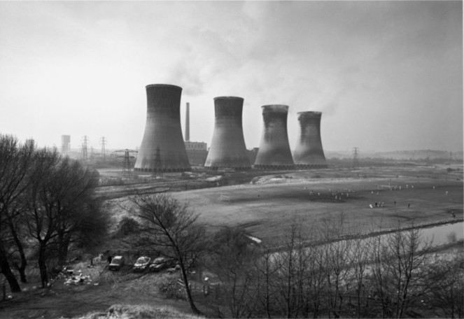
John Davies, Agecroft Power Station, Salford, 1983

powerstation

Looking at this photo, I was asked to consider what would have been the effect of taking the shot from ground level, from the same distance or even nearer to the towers? Also, what is the effect of being able to see the football game being played in the shadow of the towers?

If the photo was taken at ground level – both at the same distance or closer up, you would not be able to the surroundings as well. Here we can see the land is quite vast and is even a place to play football, if the viewpoint was different we wouldn’t have a good sense of the landscape. In the original photo, the power station almost looks out of place because it has been built on flat land so it doesn’t really match the environment. If it was taken closer up at ground level we may be able to see the detail of the structures more, however, the shapes would seem different since we are much smaller than the towers. This would allow you to get a better idea of the height in regards to ourselves.

Whilst the original photo isn’t necessarily aesthetically pleasing I do think it is interesting due to the wider view of the landscape. Whereas if it was taken nearer to the towers then the subject would be the power plant only. I think it’s quite interesting that you can see a football game in the original photo, this tells us that it’s clearly not a site just for the power station alone. Also, it’s not a very nice background for people enjoying their time playing outside. The fact that the towers loom over them and probably creates dark shadows add to the great impact they have on the land. Furthermore, you also have to consider environmental issues such as pollution caused by energy production.

Notes · Part 4

Environmental Issue Photography Projects

Robert Adams

  • Born in 1937, New Jersey but grew up in suburbs of Denver, Colorado
  • Started taking photos in the 1960s
  • Documents and stands up to the environmental degradation and man-altered landscapes of the American west
  • His photos depict natural beauty alongside the destruction of this beauty by industrialisation, consumerism and pollution
  • Prior to Robert Adams and the New Topographic show ‘photographs of a man-altered landscape’ – 1975 exhibition that epitomised a key moment in American Landscape photography, there was no avenue for work of this nature in photography
  • Adams helped introduce the concept of altered landscape as an art form
  • He concentrates on mundane subjects – housing developments, highways and commercial strips built on hills/open spaces
  • He is concerned about damages made to land and fragile ecosystem but there is more to pictures than criticism/social engagement
  • His work creates a sustaining and challenging mix of beauty, despair, anger, and love and as many critics evoke, hope (Peter Brown, One Life – Several Landscapes: An Appreciation of Robert Adams, SPOT, 1996.)

Burning Oil Sludge North of Denver Colorado (1973)

Credit: The Culture Trip
  • the emptiness and calm of open space is juxtaposed by the black toxic smoke
  • the smoke is captured and frozen which is quite mesmerising, this unexpected beauty reflects on issues of pollution and oil manufacturing

Mobile Homes (1973)

  • shows human impact – settlement built on natural, open land
  • mobile homes not seen as aesthetic, more of an eyesore – a contrast to the natural beauty of landscape behind

Golden, Colorado, (1969)

  • the road almost cuts through the landscape
  • human impact – alteration of the landscape
  • again, contrasted by the backdrop of natural beauty

Mitch Epstein – American Power Project

This project examines how energy is produced and used in the American landscape, as well as how energy influences Americans lives. The photos also prompt questions in regards to the power of nature, government, corporation and mass consumption

Ocean Warwick Oil Platform, Dauphin Island, Alabama (2005)

Ocean Warwick Oil Platform, Dauphin Island, Alabama 2005
Credit: mitchepstein.net
  • ugly metal heap – abandoned in the middle of the ocean
  • destruction of the landscape – impact on natural beauty,
  • damaging ecosystems and killing wildlife, potential oil leaks – harmful to environment and wildlife
  • not in use anymore (no purpose) but still causing issues

Amos Coal Power Plant, Raymond City, West Virginia (2004)

Amos Coal Power Plant, Raymond City, West Virginia 2004

  • contrast of the ugly, industrial and urban power plant in the background
  • compared with beautiful greenery and gardens
  • however, energy is needed to maintain the areas of beauty (machinery)

BP Carson Refinery, California (2007)

BP Carson Refinery, California 2007

  • likely to have been built on natural landscapes
  • increasing industrialisation – requires more energy production
  • we all use it but also deem it as an eyesore and are aware of the environmental issues

Fay Godwin – Our Forbidden Land (1970)

She focuses on the privatisation of land and her disdain for it. The work addresses modernisation, development of land and lack of funding for local authorities – cannot preserve paths and landscape. The photos also reflect on public right of way being violated and how even more sites will be privatised/fenced off if action not taken

  • shows authority – seems like orders due to font and use of capitals on sign
  • changing the way we interact with nature
  • needed to maintain areas of natural beauty – erosion etc.
  • separation/division shown by the brick wall – animals restricted too

  • the photo shows Stone Henge and the fencing in place around it
  • local to me but I’ve never been up close due to restrictions
  • have to put up fences and monitor access due to human impact like vandalism
  • used to be allowed to visit – example of the reduced freedom that Godwin focuses on
Part 4 · Research & Reflection

Holiday Photos

This exercise involved me looking at some of my holiday photos. I then made notes answering the suggested questions in the coursework.

What was the motivation for taking them? Did I consider composition, viewpoint or lighting? Did I go back at a later time? Why not buy a postcard?

Sunset – taken at Middelkerke, Belgium

  • aesthetically pleasing
  • memory (location – beach)
  • did consider lighting – waited for sunset – shadows/colours composition – sand, sea, sky – focus

Belfry of Bruges – taken in Bruges, Belgium

  • document – central in city / stands out
  • interesting architecture
  • took again at a better position and better lighting
  • composition/viewpoint – looking up to get top of the building makes you feel even smaller

City of Bruges – Belgium

  • good feel of city, memories, sense of place, imagine
  • aesthetically pleasing
  • did consider lighting, composition, viewpoint but not as much – wanted to document moment (unique)

Menin Gate and Tyne Cot Memorial Cemetery – taken in Ypres, Belgium

  • important history, poignant
  • something everyone should visit
  • wanted to share/encourage people to visit and learn
  • did consider lighting/composition/viewpoint – do it justice
  • important to be respectful and not spend too long taking photos sensitive location – can’t fully understand through photo

Bamburgh and Norham Castle – taken in Northumberland

  • felt like they were significant features of locations
  • stand out – easy to remember so evoke memories
  • aesthetically pleasing
  • considered lighting, composition, viewpoint – best angles to fit in the castle and looking through the arch (artistic)

Cove Harbour – taken near the Scottish Borders

  • aesthetic place and photos
  • wanted to save memory – nostalgic
  • artistic – landscape, colours (painting)
  • considered lighting, composition, viewpoint – got in the whole cove and went higher up (perspective)

Which images give more than a record of place? What are the special qualities? What do they have in common?

I think that the street photos (taken in Bruges, Belgium) are the ones that take you back because they are more unique and harder to replicate. This is probably because the people in the photos add a sense of ‘life’ and make it easier to imagine what it’s like to be there. When viewing these photos you are able to see what individual people are doing, some who are probably local and very familiar with the surroundings, and other tourists visiting like I was. Photos like this in which complete strangers add to the authenticity of the photo make me wonder whose photos I may be in the background of.

Technology makes it easy to snap away and sort results out later. Does it devalue the final image if little or no thought has gone into the photography?

Mobile phones (and similar technology) have made it very easy to take photos whenever and without wasting film. There are many positives to this, particularly the fact that we can document more so the chances of getting more interesting photos are increased. It also means we can save memories to look back on at a later date and they can be shared on a wider scale.

However, because it is so easy and editing software is readily available – maybe this means that less thought is put into the photo? Furthermore, many devices have features like autofocus and lighting improvements which means these things don’t necessarily need to be considered by the photographer as much.

Overall I think it mostly depends on the person taking the photo and the motivation behind it, if someone wants to take a more ‘artistic’ photo, rather than one that’s arguably more ‘utilitarian’, then it’s likely that things like lighting, composition and viewpoints. Also, the fact that we are able to take photos without wasting film means that we can be more spontaneous which can result in more ‘of the moment’ and unique photos because they are less set up and planned.


Notes · Part 4

Image Comparison

I went out to take some photographs myself for this exercise, there was some examples in the coursework but I thought it would be more useful to take my own.

I visited Poole, Dorset as it’s a local town I know well and the viewpoint at Constitution Hill looked to be an ideal place to take my photos. Both images depict the same subject – one from afar and the other is more zoomed in.

The photo from afar shows greenery and trees in the foreground and gives the impression of a more rural setting. The flat grassy area and bench means it is perfect location for picnics or to enjoy the view. There are also steps which implies it is an area for people to walk and explore the area more – you can see a signpost for Parkstone Heights Woods. In this photo there is also a bike which tells us that it is most likely a place that suits cycling that is away from the busier roads of the town.

The bonus of a photo from afar is that you can also get a better idea of the place and it’s surroundings. For instance, in the background we can see a more urban landscape, as well the sea. Therefore, even if you aren’t familiar with Poole, you know that it is on the coast.

In comparison, when looking at the same subject, now from a closer perspective we are able to see the town and urban scene better. The photo is made up of various buildings and we can see that the town is clearly quite built up with examples of infrastructure – such as the buildings, roads and machinery. You can also see housing so we know it’s a residential area too. For someone that doesn’t know Poole, this photo may help them assume that it is a bigger town with plenty of facilities.

This photo is also much less aesthetically pleasing due to it being very industrial and the buildings themselves are all fairly dull in colour. This is not helped by the fact that it was a very grey and dull day. However, with the first photo I think that the grey skies add some mystery as it’s harder to make out what is in the distance and therefore seems somewhat arty. Yet when you zoom in more it becomes clear that the subject is not particularly interesting or visually pleasing to look at.

Notes · Part 4

Absence of Familiar Objects

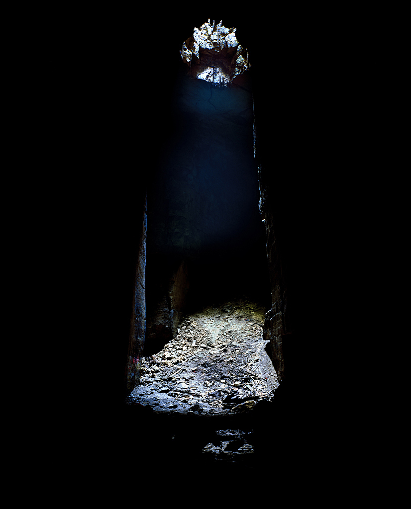
I was asked to look at the below image and to think about the effect of an absence of familiar subjects within it. Here are some notes I made with regards to my thoughts about it.

Image result for jesse alexander cathedral

Since you can’t work out what the image is depicting, there is certainly an element of mystery in it. Without any information, it’s quite confusing, however, maybe that adds interest? The image itself is quite dark which obscures the subject and location, also it’s hard to get a good idea of the distance and perspective. The textures shown imply age because it doesn’t look like the subject is in its original condition, suggesting it may be something that has been around for some time. As it’s difficult to know what exactly the image is showing, it makes it harder to understand the photographer’s intentions, meaning the viewer may have less of connection with it. On the other hand, it could prompt deeper contemplation and allows the viewer to create their own meanings and draw conclusions about what it may be portraying.

I then looked at the caption: Jesse Alexander, ‘Cathedral’, Box Freestone Quarry, Wiltshire, 2008 – which immediately gives you more information and takes away some of the confusion.


Notes · Part 4

A Sense of Place – Introduction

Space, placement and depth in images are shown by juxtaposition and perspective.

Juxtaposition – contrasting objects, images or ideas are placed together or described together so that the differences between them are emphasised

Perspective – the act of representing three-dimensional objects on a two-dimensional surface so as to give the light impression of their height, width, depth and position in relation to each other

– the appearance of viewed objects with regard to their relative position, distance from the viewer

– placing smaller objects near to the camera can balance the composition with larger object further away, creating a sense of depth in the image.

Example: Ian Berry’s images of Whitby, North Yorkshire 

https://pro.magnumphotos.com/C.aspx?VP3=SearchResult&STID=2S5RYDIDH861


When thinking about the same images without the people – how does this affect the sense of Whitby as a place?

I think that the photos would become colder and less personal if there were no people in them. They would certainly become more mysterious as you have less of an idea about what was happening when the photograph was taken. They may arguably be less interesting because they aren’t as unique. I think that without the people in these photos, Whitby could look abandoned – the black & white definitely contributes to this. Overall I think it makes it harder to imagine a sense of place because the people add enjoyment and provide an idea about the activities and lifestyle of Whitby.

Notes · Part 4 · Research & Reflection

Photography as evidence or as part of the work?

For this exercise, I was asked to conclude my work on photography and time by reflecting on the role of photography in the work I just I’ve looked at – and similar projects.

In particular, I was prompted to think about whether the photography simply providing an authentic record of the artwork – photography as evidence, or is it part of the work itself?

  • Personally, I think it can be seen as both evidence and as part of the work, it really depends on the viewer and how they choose to see it.
  • Land art, sculptures and similar work are often temporary (place and time-specific) – therefore photographs are a way of documenting or ‘saving’ them to be viewed after the original is no longer there
  • Research/documentary photography is part of the process for Richard Long (and other artists), however, there is also beauty in the photos themselves as they are unique and can be seen as art and a part of the work in their own right
  • A photograph may be the only way that some people get the chance to see work like that of Richard Long – therefore the photo becomes significant to the work and particularly it’s accessibility and longevity
  • Photos allow land art and similar projects to be shared and seen on a wider scale much mere easily
  • It could be argued that a photo does not provide the same experience as it’s not as authentic and real
  • It’s also very possible that details may not be as clear when photographed and the impact or purpose of the artist may not be as apparent and successful


Part 4 · Research & Reflection

Richard Long: Heaven and Earth

As part of a research point, I was asked to listen to a talk by curator Clarrie Wallis in regards to the show Richard Long: Heaven and Earth at Tate Britain in 2009. Below are some notes I made.

  • Richard Long was born in Bristol in 1945
  • Over 40-year career – began when boundaries of art were broadening
  • New type of art in dialogue with nature
  • Language and ambition of art was due for renewal
  • His work stems from a love of nature/walking – Britain, Sahara, Arctic
  • Focus on rural and far afield locations
  • Only uses natural organic materials
  • Interest in symmetry, repetition, measurement – the scale of his work depends on response to a particular landscape
  • Use of stones – markers of length, days
  • Creates work by following a straight line for a certain amount of time, following a river, by looking at rock placement etc.
  • Adjusts natural placement of rocks/vegetation rather than changing landscape drastically
  • Direct experience of the land – landscape itself became an art object
  • Never identified as a land artist – use landscape in way different to traditional representation and says his work has too much to do with conceptualism and minimalism
  • Everything in state of motion, continuous path
  • Uses simple/everyday materials to challenge ideas of form, medium, creative process, meaning
  • Sand sculptures
  • Made journey from London to Ben Nevis and took a photograph of the sky & face down each day
  • Interest in creative process rather than end product
  • His art is an event rather than a destination
  • Originally saw photographs as purely documentary material and not work itself – became an alternative art medium for him over time and now considered as work/art in its own right
  • Different ways to present work – photograph, postcard, sculpture, text, artist book
  • Uses lines, spirals, concentric circles – in fields as an example where aa diagonal line represents position of the sun in different places (168 hours different, 225 miles)
  • Two objects become related to each other via a third (sun), in context of time, distance, memory and travel
  • Extend boundaries of sculpture – still looking at material and form but also place
  • Position of viewer and alignment challenged
  • Uses himself as a measure of space, scale and time
  • Art is idea, art is action
  • Relocate sculpture from studio to natural world – making it more accessible?
  • Transience – won’t last forever – will become part of natural environment again

Additional land art research:

Aleksandra Mir, First Woman on the Moon, 1999 – a giant beach sculpture in which a lunar landscape was recreated using bulldozers on a beach in the Netherlands. Mir planted an American flag in the sand and called herself the first woman on the moon. The performance commented on gender equality and makes the statement that the only way a woman would have the chance to stand on the moon is if they build it themselves.
www.aleksandramir.info/projects/first-woman-on-the-moon/