Part 5 · Research & Reflection

Fashion garment analysis

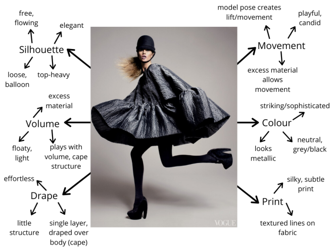
For this exercise, I chose to use this image of Gisele Bündchen in a Balenciaga grey silk cape by Nicolas Ghesquière. Photographed by David Sims for Vogue, 2006.

Mind Map (1)
Image credit: https://www.vogue.com/article/masters-of-the-house-a-look-back-at-balenciaga-in-vogue

What are the textile qualities present? 

Silhouette: The garment is a cape so it’s designed to be loose and free moving due to excess fabric. Not figure hugging and cuts off above knees. The rest of the outfit is more fitted and in a simple black to keep attention/focus on top half of the models body, and the garment itself.

Volume: Ghesquière plays with volume through the pleating of extra fabric to create a cape and almost balloon or parachute effect. The volume conveys that the material is light and able to float/move.

Drape: The cape appears fairly effortlessly draped over the models body due to it being aingle layer of material. Furthermore, there is little rigid structure.

Movement: The excess material allows movement because it isn’t tight fitted or structured, instead it’s more free flowing. The model appears playful and David Sims is known for his candid poses that capture more dynamic movement and in this case, also creates lift from the cape.

Colour: Due to the cape being a neutral grey, the colour is very minimal and subtle. Also, the other accessories are black, against a grey background. The silk fabric looks sophisticated and elegant, almost with a metallic effect due to the sheen of the silk.

Print: This wouldn’t be a garment picked out for the use of print however, if you look closely there are some lines that add texture to the silk.

What is the context of the garment? What is the image for?

The garment itself was part of the Balenciaga Autumn/Winter Ready-To-Wear collection, 2006. In this Vogue article by Sarah Mower she highlights how Ghesquière created ‘extraordinary volumes’, ‘new proportions’ and a ‘powerful modernity’ – reflecting 1950 couture. For this particular photo of the garment, Gisele Bündchen was photographed by David Sims in New york, July 2006.

How does this affect its appearence and focus?

Whilst I don’t know what intentions David Sims had for this photo, his definitely highlight the volume and movement or the cape. The idea of ‘powerful modernity’ fits the styling and composition of the photo.  The neutral background and candid/action pose showcases the textile qualities and the model still appears elegant but playful and modern.

How do you relate to the image?

Gisele Bündchen looks elegant and sophisticated but also powerful, important and busy which I think creates a healthy portrayal of women. It’s certainly a fashion photo that I find more interesting and dynamic than some traditional model poses and they can sometimes appear vacant or too ‘perfect’. I think David Sims manages to showcase the garment and model in an engaging way that makes it a more aesthetic image to me.

Is the model important?

The particular pose is important to the overall effect of photo. The model has to understand the garment – it’s textile qualities an how it moves, as well as working with the photographer to create a successful photo. It’s possible that some people couldn’t achieve the desired candid and playful pose while still looking elegant and keeping focus on the garment.


Part 5 · Research & Reflection

Print and Patterns

When thinking about high street brands that are characterised by their use of print and pattern I instantly thought of Cath Kidston. This was a brand that was very popular whilst I was at secondary school so I became familiar with a lot of their prints and patterns, especially the floral ones since I think that is what they’re best known for. Other similar brands include Emma Bridgewater and Orla Kiely. Another designer brand that came to mind was Louis Vuitton, it’s not something you necessarily see as often since it’s a more luxurious and expensive brand. However, the Louis Vuitton logo is easily recognisable as one of their most popular design patterns, particularly on bags.

Orla Kiely multi-stem fabric, tomato and Emma Bridgewater Polka Dot Serving Plate – johnlewis.com and abraxascookshop.com

Do you think it is primarily about aesthetic considerations or is it an attempt to create an identifiable brand?

I definitely think that the aesthetics of these prints and patterns are a significant part of the brand. The designs have to be interesting, different and should fit the style of the brand. Cath Kidston is known for vintage and typically floral prints, it is often described as being quintessentially British so therefore a bright neon or stark black design wouldn’t necessarily fit the aesthetics of the brand and what customers like. An important factor of the aesthetics is the marketability. Creating an identifiable brand helps this because the prints and patterns become recognisable and more desirable. Like many other fashion designer brands, the Louis Vuitton monogram has also become a symbol of sophistication, luxury and wealth – making them one of the most popular fashion houses today.

Cath Kidston Stanley Mug and Alma PM Louis Vuitton bag – cathkidston.com, uk.louisvuitton.com

By doing this, these brands have been able to take their familiar prints and pattern to produce various products such as fashion accessories (bags, purses etc.), household items (mugs, beauty products etc.) as well as fashion pieces.

Mary Katrantzou 

  • Greek fashion and textile designer – born to a textile designer father and interior designer Mother
  • became known for her busy prints – often give the effect of being intoxicated
  • her prints are seen as art themselves so are highly collectable
  • garments are uplifting, fun, beautiful and flatter the weather despite the dynamic prints
  • she has always been inspired by women for her work
  • takes placement to an extreme level
  • uses contemporary digital print technology
  • designs garment shape and cut at the simultaneously with the print design – achieves unique compositions and interesting optical effects on the body
  • digital print technology allows photo-realistic images to be printed directly onto textile substrates using a CMYK print process
  • pushes print to the limit and questions if there is a limit

I also read up about her ready to wear Fall 2011 collection – https://www.vogue.com/fashion-shows/fall-2011-ready-to-wear/mary-katrantzou

Tim Blank writes about how Mary Katrantzou wanted this collection to be more about the woman in the room, rather than the room on the woman like her tour de force interior-exterior decoration.

She describes the collection as being more fluid/real – in a way very lively and dynamic way that is. Katrantzou imagined the woman as a connoisseur -surrounded by objects of beauty – Fabergé eggs, Meissen porcelain, Cloisonné enamel and Ming vases. This helped to create hyper-vivid, colourful prints. The silhouettes in this collection were inspired by the haute couture wardrobes of their imagined owners. Legendary style icon names like Diana Vreeland, Babe Paley and the Duchess of Windsor were mentioned. She also used a softened silhouette which added a new layer of interest and was for any woman who went to wear her work, rather than hang it on a wall.

What do you make of the article’s reference to ‘the room on the woman’ and ‘the woman in the room’?

This collection focuses on the woman and how textiles are used to compliment the body and allows you to see her garments as art, rather than focusing on the collection as a whole in the room. Each women is highlighted as unique, special and beautiful – and not just a surface to display the garments.

Anna Schilling and Imogen Newton, wearing Mary Katrantzou, 2011 – vogue.com


Part 5 · Research & Reflection

Chanel’s use of tweed

To start this research I was asked to first look Chanel’s Autumn 2013 ready-to-wear collection, which you can find here.

The clothes in the collection were dark with the key silhouettes being streamlined – one favourite ‘was fitted to the hip, then flared into a short skirt over leather cuissardes’ and another was ‘cut high on the thigh at the front, dipping to mid-calf at the back’. A large dark globe revolved above Karl Lagerfeld, although it was as if it was nighttime (matched by the dark palette of textiles used), it was not depressing. A metallic thread was woven through the pieces and the tweed shined and I think there is a cosmic and otherworldly feel to the collection.

This image below shows the way in which Chanel explores different designs, fibres and composition to update and bring something new to the traditional tweed. The metallic thread and black velvet ribbons create an interesting effect, it reminds me of armour or again something very futuristic and space-like.


Senait Gidey photographed by Yannis Vlamos for Chanel, Autumn 2013 – vogue.com

I then read this article from Elle: https://www.elle.com/fashion/news/a15402/the-story-of-chanels-tweed/

Chanel is known for iconic tweed pieces like their dresses, jackets and skirts. The use of the fabric was first inspired by menswear after Chanel borrowed sportswear and found that it would lend itself well to her designs. It’s comfortable, supple but has a sophisticated look – something the Chanel brand is known for today. From 1924, the tweed fabrics started production in a Scottish factory and Chanel chose colours that were inspired by the Scottish countryside. Quickly becoming a popular look, especially in Parisian couture houses and she began using a factory in Northern France during the 1930’s. It was here that she started mixing the classic tweed fabric with silks, cottons, wools and sometimes cellophane which made it more lightweight and gave it a high fashion style.

In the 50s and 60s the Chanel tweed jacket became a staple for those in the upper class – both in Britain and America. It was less restrictive and fitted more like a cardigan which offered the sophisticated and fitted style in a more comfortable structure. Jacqueline Kennedy is known for her pink tweed Chanel suit, she wore it multiple times during John F. Kennedy’s presidency but it is now infamous for being what she was wearing during his assasination in 1963. It has become one of the most referenced and remembered outfits and is arguably her trademark.

Pink Chanel suit of Jacqueline Bouvier Kennedy - Wikipedia
Pink Chanel tweed suit worn by Jackie Kennedy, pictured in 1961 – wikipedia.com

Still today, Chanel’s use of tweed is celebrated by those in fashion and other designers and retail business have experimented with tweed to offer more affordable pieces in order to achieve a similar style.


Part 5 · Research & Reflection

Fashion images

Below are some notes and images relating to some famous fashion photographers:

Irving Penn

  • simple, sophisticated
  • showcased clean lines & tapered waists of postwar Paris and New york
  • transformed aesthetic of the fashion industry
  • removed everything from shot besides clothing and model
  • inspired by Surrealism, Modern dance, film noir
  • makes provocative visual statements, not just commercial
  • firm grasp of the body, consumerism and the history of art
  • bridged gap between fashion photography cat
  • known for iconic Vogue covers
  • also known for his – ‘corner portraits’ in which he put celebrities into tight corners in awkward poses – revealed unfamiliar elements of their personalities
Jean Patchett and Rochas mermaid dress, photographed by Irving Penn for Vogue, 1950 – vogue.com

Mario Testino

  • has become one of the best known/celebrated fashion photographers
  • work featured in Vogue, V Magazine, Vanity Fair and GQ
  • created image, for Gucci, Burberry Versace, Chanel, Michael Kors, etc.
  • luxury realism
  • intends to capture subjects in moments of engagement or expression – opposed to vacant, glassy-eyed aesthetic of his contemporaries
Cara Delevingne and Taylor Swift by Mario Testino, 2013 & 2015 – mariotestino.comvanityfair.com

Richard Avedon

  • portraits famous for minimalism
  • ability to put his subject at ease – helps him create true, intimate, and lasting photographs
  • black & white portraits – colour creates unwanted distraction commercial fashion
  • photographer groundbreaking fine art portraiture
  • one of the most influential photographers of the 20th century – ‘helped define America’s image of style and beauty and culture’ – New York Times
  • created innovative contexts – memorable images
  • the subject would often take up and most of the composition – appearing cropped
  • candid, emotive – expressive art form (photography)
  • signature white background – no context/story
  • subjects able to move freely – creates movement/spontaneity
Stephanie Seymour for Versace by Richard Avedon, 1993 – vfiles.com

Sarah Moon

  • known for soft, dream-like/fantasy and graphic images
  • unusual style but gained respect in the fashion photography industry
  • images have a focus on composition and shape
  • romantic and melancholy feel to images
  • often uses jewel tones
  • began modelling before starting fashion photography
Issey Miyake and Yoji Yamamoto by Sarah Moon, 1995 & 1996 – philips.commichaelhoppengallery.com

Is it art?

The relationship between photography and art is an interesting debate, some see photography merely as a tool. For example, it is a tool to showcase these dresses and the models wearing them. However, many would consider these photos art due to the choices made by the photographer. Avedon’s ability to portray movement and Sarah Moon’s choice of colours and graphic style are examples of this.

Furthermore, I believe all of these photographers help to elevate the garments – from the shape, form, colours and details to the textile qualities themselves. Photography also allows these dresses and the work of the designers to be seen on a wider scale so is valuable to the fashion industry.

Notes · Part 5

Layering qualities of textiles

I read pages 68-70 of Room Three: ‘Fantastic’ of Place (Dean & Millar)

Gregor Schneider’s ‘Totes Haus ur (Dead House ur)

Gregor Schneider - Kehrer Verlag
Gregor Schneider, Totes Haus ur, 2001 – kehreverlag.com

  • vacant apartment, Rheydt – continual alteration
  • a strange labyrinthine space that exists behind a tiled three-storey facade
  • walls built in front of other walls – changes are perceptible but unrecognizable because walls are identical
  • lined with a thick, sound-insulating material, like lead
  • alters the rooms’ characteristics in invisible ways oppressive atmosphere
  • windows built in front of other windows, lamps placed in spaces between – light floods through even at night
  • entrances are hidden behind walls, doors unable to be manipulated from the inside (loose handles)
  • intense spatial and temporal dislocation – suggests a moral one too
  • remind us of horror movies, news reports – should be wary
  • form of exploration of a greater collective memory
  • communities lost – those displaced by large scale ma strip- mining nearby – places haunted by those who once belonged there

Architectural Palimpsest

– a manuscript or piece writing on which has been superimposed on effaced earlier writing

– something reused or altered but still bearing visible traces of its earlier form

The following two quotes are from Architectural Palimpsest – Rethinking The Architecture by Juan Gatica – Which you can find here.

‘When reading architecture as a Palimpsest it can be interpreted in three ways: the former meaning, the new meaning and a hybrid interpretation’

‘An architectural piece from which, while subtracting, but maintaining the inherent qualities of the same, begins to define the design intervention from a completely different view’

Layering textiles have many purposes – they can cover, hide, envelop, disguise and transform an object, person and place. It can also change the perception of something – fully or partially, it may add/take away from the original and other layers or reveal something new.

Exhibitions & Books · Part 5

Christian Boltanski – Personnes

Christian Boltanski’s 2010 installation ‘Personnes’  

Christian Boltanski, Personnes, 2010 – photo by Didier Plowy – eva-albarran.com

Art or Design – Installation art, not functional and more about the contemplation it causes.  An example of contemporary art as it challenges the boundaries of art. The components only become ‘art’ when in the context of Boltanski’s installation.

Temporary or Permanent – Was open during January and February of 2010.

Large or Small scale – On view in the Grand Palais, Paris and part of the 13,500 square metre exhibition space.

Transforming and/or Defining and/or Forming – The whole space is used and transformed due to the large crane with a metal grabber, piles and the large mound of clothes, as well as the sound of heartbeats.

Immersive and/or Distant – Viewers can walk amongst the work and alongside the piles of clothes. It is a whole experience and not something viewed from a distance.

Pattern and/or Colour and/or Repetition and/or Shape – The installation uses the repetition of piles of clothes and street lights to form the grid shape and a large mound. Repeated audio of heartbeats is also used within the space.

Before answering the questions below I also read Laura Cumming’s article with The Guardian, which can be read here.

The noise of heartbeats permeates the exhibition, why do you think that is?

  • makes it a more immersive experience
  • links to the apparent themes of life and death
  • feels more personal (each heartbeat is unique to a person)
  • can be linked to the clothes (also represent a person)
  • adds deeper meaning and creates further questions – are the sound and visuals connected? What happened?
  • also adds emotion – heartbeats can be both joyful/comforting and eerie/sombre

To what extent are the textiles transformed into something other than fabric?

  • they are a metaphor for deeper themes – mortality, the inevitability of death, time etc.
  • they symbolise someone, a life and a story
  • represents the loss of lives and suffering

What’s the significance of the installation title and the mechanical grabber?

  • the title means both people and nobodies – represent people but they are anonymous and still unknown to us
  • highlights issues of status, people may be known in life but we are all the same at death
  • the mechanical grabber may signify chance or the ‘hand of God’
  • also links to the idea of time and how life is short
  • life and death is a continuous cycle
  • can also link it to consumerism and poor attitudes to waste – disposable

What associations does this work conjure up in your mind?

  • life and death
  • the loss of lives – particularly through violence, murder and diasters
  • makes me think about the holocaust, genocide and mass murders
  • reminds me that death does not discriminate
  • I also associate it with time and how we can’t control it or how much time we have to live (can manipulate and try but death is inevitable)
Notes · Part 5 · Research & Reflection

Marianne Straub

What function is Straub’s textile serving here other than providing something hard-wearing to sit on?

To do this exercise I revisited some of my work on visual communications, particularly denotation and connotation.

Denotation

At the simplest level, we know this textile was designed to cover seating on transport. Straub was commissioned to design it to highlight the new Victoria Line.

Connotation

The design compromises of a geometric pattern in dark (green and blue) colours. I think this choice was made because it needs to be inoffensive and something that isn’t too bold or colourful that it becomes distracting. The seats need to be durable enough for everyday wear and tear, as well as being able to withstand dirt, waste, spillages and potential vandalism. Having a constant textile and pattern also allows an identity to be formed and it’s likely people using the transport will begin to recognise and become familiar with the design.

Part 5 · Research & Reflection

Research point

Yayoi Kusama; Infinity Mirrored Room, 1998

Art or Design

I would class this as art because I think the visual effect and aesthetic is more important than any sort of function.

Temporary or Permanent

Large or Small scale

This project filed an entire room so is a large scale piece. However, I do expect that the mirrors may have distorted and changed how the space felt for those experiencing it.

Transforming and/or Defining and/or Forming 

The room was definitely transformed through the creation of this project and forms a place within a place since it’s so different from anything we see in normal environments.

Immersive and for Distant

I think it is certainly an immersive project because you have to encompass yourself within the room to fully experience it.

Pattern and/or Colour and/or Repetition and/or Shape

Kusama uses the repetition of the dot pattern and similar colours throughout the entire room to create the environment she had visioned.

Yayoi Kusama, Dots Obsession, Infinity Mirrored Room, 1998 – artribune.com

Ronan and Erwan Bouroullec, Clouds, 2008

Art or Design

These were designed with various functions in mind. They are connectable and allow you to build the textile clouds. They can also be hung on the wall, suspended from the ceiling or can absorb sound and act as a space divider.

Temporary or Permanent

I think it can be considered both temporary and permanent because some people may decide to build it once and leave it to serve a specific purpose. However, you can also change the way the segments fit together and how they are used so it then becomes more temporary.

Large or Small scale

Again, since the pieces are buildable it allows the project to be both large and small when it comes to scaling.

Transforming and/or Defining and/or Forming

The clouds can be used to transform a space – such as a spatial divider. Additionally, you can form your own shapes because you’re provided with the segments separately.

Immersive and for Distant

The work is both immersive and distant. On one hand, you have to connect the pieces yourself but then it can then be viewed and appreciated from a distance – especially bigger pieces for decoration.

Pattern and/or Colour and/or Repetition and/or Shape

I think this work utilises all of these since you can create various patterns and shapes with the individual segments. It requires the repetition of similar shapes to create a bigger piece, also mixing different colours to add to the visuals.

clouds-by-ronan-and-erwan-bouroullec-bouroullec_clouds-focus-23.jpg
Ronan and Erwan Bouroullec, Clouds, 2008 – dezeen.com

Marianne Straub: Moquette Textile, 1970

Art or Design

Since this textile was created with a specific use in mind (public transport seating), I would say this is design rather than art.

Temporary or Permanent

This is perhaps harder to decide – I think it was designed to be permanent for seating on transport but since it’s a public service it can likely be changed without the designer’s permission.

Large or Small scale

The design itself is fairly small but when you think about how many seats may have been covered with the pattern, the scale of the work becomes much larger.

Transforming and/or Defining and/or Forming

Rather than transforming the transport seating, it instead defines them and perhaps added more interest with a new pattern.

Immersive and for Distant

It’s immersive as you need to use the transport service to see it properly. However, I don’t think the design of the seating is necessarily at the forefront of peoples mind when travelling, it’s something they will probably subconsciously see. Therefore I think there a sense of distance.

Pattern and/or Colour and/or Repetition and/or Shape

This textile is comprised of repeating blocks of colour to create a pattern.

Marianne Straub, Moquette Textile, 1970 – Itmuseum.co.uk

Part 5 · Research & Reflection

Christo and Jeanne-Claude

Art or Design

Temporary or Permanent

Large scale or Small scale

Transforming and/or Defining and/or Forming

Immersive and/or Distant

Pattern and/or Colour and/or Repetition and/or Shape

Surrounded Islands, Biscayne Bay, Greater Miami, Florida, 1980-83
Christo and Jeanne-Claude, Surrounded Islands, 1980-83 – christojeanneclaude.net 

  • In May 1983 the installation of ‘Surrounded Islands’ was completed in Biscayne Bay, Greater Miami, Florida.
  • 11 islands were surrounded with 6.5 million square feet of floating pink woven polypropylene fabric that covers the surface of the water & extends 200 feet from each island into the bay.
  • Sewn into 79 patterns to follow contours of islands.
  • For 2 weeks ‘Surrounded Islands’ was seen, approached and enjoyed by the public – from causeways, land, water and air.
  • The luminous pink colour is harmonious with tropical vegetation, the Miami sky and colours of shallow waters in Biscayne Bay.
  • Preparation of islands began in April 1981 – marine and land crews picked up debris and refuse was removed. Forty tomes of garbage that included refrigerator doors, tires, sinks, mattresses & abandoned boats.
  • The outer edge of fabric attached to a 12-inch diameter octagonal boom connected to anchors (specially made).
  • Tended to day & night by 120 monitors in boats.
  • Highlights ways in people of Miami live between land and water.

Wrapped Trees Project 

Art or Design

Temporary or Permanent

Large or Small scale

Transforming and/or Defining and/or Forming

Immersive and for Distant

Pattern and/or Colour and/or Shape

Wrapped Trees, Fondation Beyeler and Berower Park, Riehen, Switzerland, 1997-98
Christo and Jeanne-Claude, Wrapped Trees, 1997-98 – christojeanneclaude.net 

“The ‘wrapping’ is NOT at all the common denominator of the works. What is the really common denominator is the use of fabric, cloth, textile. Fragile, sensuous and temporary materials which translate the temporary and character of the works of art.”

  • November 1998, 178 trees wrapped with 592,075 square feet of woven polyester fabric (used in Japan to protect trees from frost and snow during winter).
  • 14.3 miles of rope.
  • Located in the park in Foundation Beyeler and Berower Park, Riehen, Switzerland.
  • Height of trees varied from 82 feet and 6.5 feet, diameter from 47.5 feet to 3.3 feet.
  • Branches pushed the translucent fabric outward & created dynamic volumes of light and shadow. Also, moving in the wind to create new forms and surfaces, shaped by the ropes on the fabric.