Below are some notes I made for the introduction to this section of Textiles:


Below are some notes I made for the introduction to this section of Textiles:
I read pages 68-70 of Room Three: ‘Fantastic’ of Place (Dean & Millar)
Gregor Schneider’s ‘Totes Haus ur (Dead House ur)
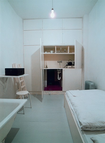
Architectural Palimpsest
– a manuscript or piece writing on which has been superimposed on effaced earlier writing
– something reused or altered but still bearing visible traces of its earlier form
The following two quotes are from Architectural Palimpsest – Rethinking The Architecture by Juan Gatica – Which you can find here.
‘When reading architecture as a Palimpsest it can be interpreted in three ways: the former meaning, the new meaning and a hybrid interpretation’
‘An architectural piece from which, while subtracting, but maintaining the inherent qualities of the same, begins to define the design intervention from a completely different view’
Layering textiles have many purposes – they can cover, hide, envelop, disguise and transform an object, person and place. It can also change the perception of something – fully or partially, it may add/take away from the original and other layers or reveal something new.
What function is Straub’s textile serving here other than providing something hard-wearing to sit on?
To do this exercise I revisited some of my work on visual communications, particularly denotation and connotation.
Denotation
At the simplest level, we know this textile was designed to cover seating on transport. Straub was commissioned to design it to highlight the new Victoria Line.
Connotation
The design compromises of a geometric pattern in dark (green and blue) colours. I think this choice was made because it needs to be inoffensive and something that isn’t too bold or colourful that it becomes distracting. The seats need to be durable enough for everyday wear and tear, as well as being able to withstand dirt, waste, spillages and potential vandalism. Having a constant textile and pattern also allows an identity to be formed and it’s likely people using the transport will begin to recognise and become familiar with the design.
Recently I’ve tried to be more aware of the everyday textiles, beyond clothing because I think that’s more obvious.
Here are some textiles that are used in more functional ways in which I’ve seen whilst gone about my normal life.
Curtains – from Dunelm
I think that curtains are the sort of everyday items that we don’t necessarily think about or even notice. They have a function and that’s all we really need to know, besides perhaps the style, colour and sizing when first purchased. However, they’re an important and useful textile that we expect to serve its purpose and last.

Slippers – from Primark
Again, slippers are fairly simple items that we may not think about after buying them. However, there are various processes that go into the design and making of them. Such as the cable knit design I’ve got on my slippers.

Cushion cover – handmade by a friend
This cushion cover was handmade by one of my Mum’s friends. She used material scraps to combine the different patterns and this goes back to the idea of handmade items seeming more unique. You can imagine the time that went into creating the cover and I think these textiles are often more appreciated in everyday life.

Cinema – The Plaza, Dorchester (renovated by Picturedome Cinemas LTD.)
Usually, when visiting the cinema I don’t necessarily pay attention to the different uses of textiles. Of course, there are the things we’re more aware but I also looked for other uses. The Plaza in Dorchester opened in 1933 and has now been renovated by Picturedome Cinemas LTD. Since it’s a historic building and much smaller than more well-known cinemas I think the use of textiles is important to the aesthetics. For example, the stairs, rope barriers or curtains give an older and more vintage feel to the interior.

School
I work at a primary school which has multiple uses of textile, whether it’s for playing, learning or just part of the interior. In the image I took you can see some obvious examples like the carpet, cushions and material blinds. If you look closely different textiles are also used on musical instruments, like the drums. A school is the sort of environment that you could probably find a lot of textile uses.

‘The art of craft: the rise of the designer-maker;’ Justin McGurk, The Guardian (2011)
Below are some more notes from McGurk’s article.
Is there a demand for hand-made objects and work? Why do consumers seek out these qualities?
Is this desire based on romantic perception and a sense of “post-industrial nostalgia for the ‘pre-industrial?’
Are handmade products viewed as luxury or value-added products? How do they compare with mass-produced items – value, life cycle, cost and ethics?
Reflection on hand-made items I own
Paper cut print

Why was I drawn to it? was it because it felt special? Did I just like the design?
How did its price compare with industrial-produced equivalent?
Bookmark

Why was I drawn to it? was it because it felt special? Did I just like the design?
How did its price compare with industrial-produced equivalent?
Constructed textiles are made through knitting (machine/hand), weaving or other processes where fibre and chemicals are united, extruded or bonded to create a pliable material. Knitting/weaving is still the most efficient and successful means of creating sufficient quantities of textiles. However, with recent digital technology developments, we can now 3D print materials to meet personal demands. There are limits of both techniques, knitting machines control textile possibilities and 3D printing still relatively new.
Printing textiles and other embellishment and textile finishing techniques – embroidery, laminating and coating allows us to apply further aesthetic qualities onto the surface of a textile or to alter the qualities a constructed textile.
Textiles – can be very complex in structure, even simple fabrics may undergo many processes to prepare them for their intended application.
The material life cycle is more relevant because we are in a world that is becoming increasingly aware of wastefulness, longevity and individual consumption of products. Creating textiles (or any product) forces designer, manufacturer and maker to consider these consequences.
Stages of the textile product life cycle
Agriculture
My understanding – the process of taking material from its original and natural source – through cultivation/farming
Definition
Ginning
My understanding – not a term I’m familiar with, but I’d assume it’s part of the preparation stages
Definition
Spinning
My understanding – machinery is used to spin fibres together
Definition
Weaving
My understanding – threads/yarn interwoven together
Definition
Processing
series of mechanical or chemical operations in order to change or preserve it. To convert into usable material.
preparation of fabric before being made into a product
Stitching
My understanding – fabric joined together through looping of threads
Definition
Distribution/Retail
My understanding – movement of the finished product to warehouse – and then companies/shops to be sold to the public
Definition
Use/consumption and end of life
My understanding – products are used by the consumer for various purpose – clothes etc. Until worn/ conditioned deteriorates
Definition
Robert Adams
Burning Oil Sludge North of Denver Colorado (1973)

Mobile Homes (1973)

Golden, Colorado, (1969)
.jpg)
Mitch Epstein – American Power Project
This project examines how energy is produced and used in the American landscape, as well as how energy influences Americans lives. The photos also prompt questions in regards to the power of nature, government, corporation and mass consumption
Ocean Warwick Oil Platform, Dauphin Island, Alabama (2005)

Amos Coal Power Plant, Raymond City, West Virginia (2004)

BP Carson Refinery, California (2007)

Fay Godwin – Our Forbidden Land (1970)
She focuses on the privatisation of land and her disdain for it. The work addresses modernisation, development of land and lack of funding for local authorities – cannot preserve paths and landscape. The photos also reflect on public right of way being violated and how even more sites will be privatised/fenced off if action not taken


I went out to take some photographs myself for this exercise, there was some examples in the coursework but I thought it would be more useful to take my own.
I visited Poole, Dorset as it’s a local town I know well and the viewpoint at Constitution Hill looked to be an ideal place to take my photos. Both images depict the same subject – one from afar and the other is more zoomed in.

The photo from afar shows greenery and trees in the foreground and gives the impression of a more rural setting. The flat grassy area and bench means it is perfect location for picnics or to enjoy the view. There are also steps which implies it is an area for people to walk and explore the area more – you can see a signpost for Parkstone Heights Woods. In this photo there is also a bike which tells us that it is most likely a place that suits cycling that is away from the busier roads of the town.
The bonus of a photo from afar is that you can also get a better idea of the place and it’s surroundings. For instance, in the background we can see a more urban landscape, as well the sea. Therefore, even if you aren’t familiar with Poole, you know that it is on the coast.

In comparison, when looking at the same subject, now from a closer perspective we are able to see the town and urban scene better. The photo is made up of various buildings and we can see that the town is clearly quite built up with examples of infrastructure – such as the buildings, roads and machinery. You can also see housing so we know it’s a residential area too. For someone that doesn’t know Poole, this photo may help them assume that it is a bigger town with plenty of facilities.
This photo is also much less aesthetically pleasing due to it being very industrial and the buildings themselves are all fairly dull in colour. This is not helped by the fact that it was a very grey and dull day. However, with the first photo I think that the grey skies add some mystery as it’s harder to make out what is in the distance and therefore seems somewhat arty. Yet when you zoom in more it becomes clear that the subject is not particularly interesting or visually pleasing to look at.
I was asked to look at the below image and to think about the effect of an absence of familiar subjects within it. Here are some notes I made with regards to my thoughts about it.
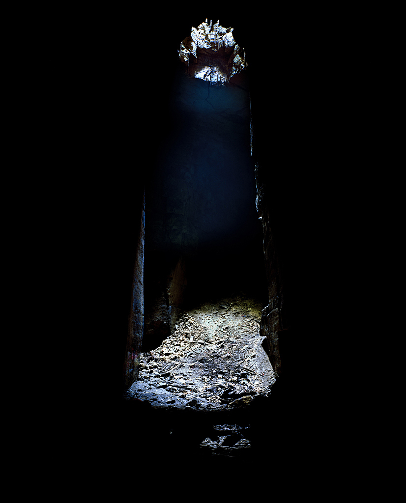
Since you can’t work out what the image is depicting, there is certainly an element of mystery in it. Without any information, it’s quite confusing, however, maybe that adds interest? The image itself is quite dark which obscures the subject and location, also it’s hard to get a good idea of the distance and perspective. The textures shown imply age because it doesn’t look like the subject is in its original condition, suggesting it may be something that has been around for some time. As it’s difficult to know what exactly the image is showing, it makes it harder to understand the photographer’s intentions, meaning the viewer may have less of connection with it. On the other hand, it could prompt deeper contemplation and allows the viewer to create their own meanings and draw conclusions about what it may be portraying.
I then looked at the caption: Jesse Alexander, ‘Cathedral’, Box Freestone Quarry, Wiltshire, 2008 – which immediately gives you more information and takes away some of the confusion.
Space, placement and depth in images are shown by juxtaposition and perspective.
Juxtaposition – contrasting objects, images or ideas are placed together or described together so that the differences between them are emphasised
Perspective – the act of representing three-dimensional objects on a two-dimensional surface so as to give the light impression of their height, width, depth and position in relation to each other
– the appearance of viewed objects with regard to their relative position, distance from the viewer
– placing smaller objects near to the camera can balance the composition with larger object further away, creating a sense of depth in the image.
Example: Ian Berry’s images of Whitby, North Yorkshire
https://pro.magnumphotos.com/C.aspx?VP3=SearchResult&STID=2S5RYDIDH861


When thinking about the same images without the people – how does this affect the sense of Whitby as a place?
I think that the photos would become colder and less personal if there were no people in them. They would certainly become more mysterious as you have less of an idea about what was happening when the photograph was taken. They may arguably be less interesting because they aren’t as unique. I think that without the people in these photos, Whitby could look abandoned – the black & white definitely contributes to this. Overall I think it makes it harder to imagine a sense of place because the people add enjoyment and provide an idea about the activities and lifestyle of Whitby.
